-
AuthorPosts
-
Hung Dinh Friend
Hung Dinh
- Join date:
- September 2014
- Posts:
- 4408
- Downloads:
- 11
- Uploads:
- 189
- Thanks:
- 309
- Thanked:
- 3310 times in 3 posts
May 26, 2010 at 10:30 am #151322Dear Friends,
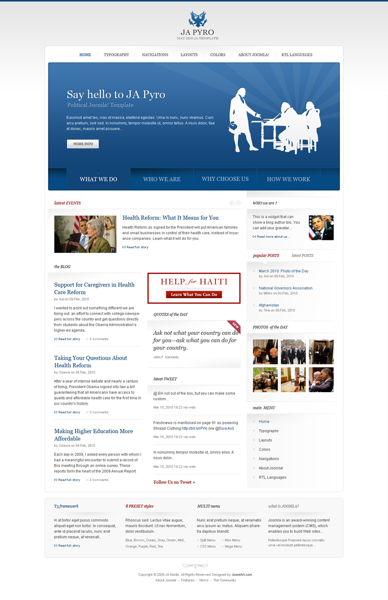
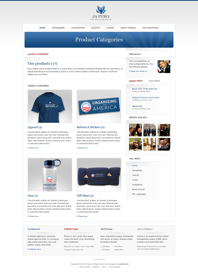
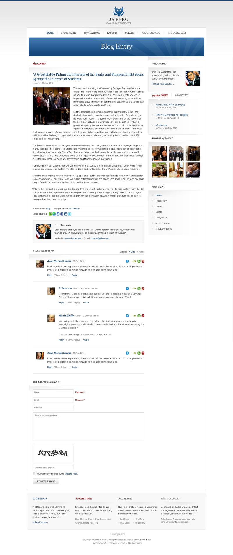
JA Pyro is the May 2010 Template and below are the preview screenshots. its a totally different theme and can be easily adapted for political sites, however, change of images and you can make it work for any requirement. It will be available for download in the coming days.
Home page: View the higher resolution HERE

Category Layout: View the higher resolution HERE

Magazine Layout: View the higher resolution HERE

Product Layout: View the higher resolution HERE

Blog Entry Layout: View the higher resolution HERE

1 user says Thank You to Hung Dinh for this useful post
k2joom Friend
k2joom
- Join date:
- March 2010
- Posts:
- 62
- Downloads:
- 133
- Uploads:
- 4
- Thanks:
- 7
- Thanked:
- 15 times in 2 posts
May 26, 2010 at 10:58 am #344783Hi,
Just wanted to say what a nice clean looking template made even better with k2 support 😉
I just wondered what you were using for the K2 Item Comments.Would love to make a demo and a review for our K2 members once this goes live.
Regards,
Simon Wells
Founder K2Joom.com
K2 Support getk2.org
k2 Blog simon.getk2.orgArvind Chauhan Moderator
Arvind Chauhan
- Join date:
- September 2014
- Posts:
- 3835
- Downloads:
- 74
- Uploads:
- 92
- Thanks:
- 1240
- Thanked:
- 1334 times in 848 posts
May 26, 2010 at 11:11 am #344784Hi Simon Wells,
its JA Comment. You can appreciate it well, when we release the demo of JA Pyro. It is also in use at JA Norite Template. Change the template color to any light color and you will like it.
Regards
Arvind
munders Friend
munders
- Join date:
- November 2008
- Posts:
- 375
- Downloads:
- 0
- Uploads:
- 37
- Thanks:
- 50
- Thanked:
- 4 times in 1 posts
May 26, 2010 at 11:31 am #344787A nice theme with good layout options, well done. 🙂
I look forward to seeing the live demo.
May 26, 2010 at 1:33 pm #344795Looks great! I really like the recent clean layouts. It’s quite refreshing.
May 26, 2010 at 2:19 pm #344799Can’t wait to try it! Thanks.
May 26, 2010 at 2:48 pm #344803Mmm looking forward to that release. I have a site that needs this touch.
suckfish Friend
suckfish
- Join date:
- February 2010
- Posts:
- 25
- Downloads:
- 0
- Uploads:
- 0
- Thanks:
- 13
- Thanked:
- 2 times in 1 posts
May 26, 2010 at 3:17 pm #344805Well done hung and the team, certainly stepping up the game against your competitors….
again well donelee
May 26, 2010 at 3:23 pm #344806Wow!!! Good job guys… Beautiful… I’ve been waiting for this kind of layout control & versatility for some time now, and here it is in front of our eyes….
I will definitely use this template once it comes out…
Well done JoomlArt!!
 zao dao
Friend
zao dao
- Join date:
- September 2014
- Posts:
- 155
- Downloads:
- 160
- Uploads:
- 2
- Thanks:
- 12
- Thanked:
- 11 times in 1 posts
May 26, 2010 at 3:57 pm #344808i have to say this template is better than joomlart Aprial and March template
the two best templates of 2010 is ja jarasite and this one ,i am really disappointed with ja ores and ja nortie,JA LIMEwww.8media.com
www.zaodao.comMay 26, 2010 at 5:58 pm #344818That`s it.. jomlart is 100% OUT OF IDEEAS SAME BASE TEMPLATE WITH SOME CSS MODIFICATIONS… but bad.. i thought joomlart can more … but…
 zao dao
Friend
zao dao
- Join date:
- September 2014
- Posts:
- 155
- Downloads:
- 160
- Uploads:
- 2
- Thanks:
- 12
- Thanked:
- 11 times in 1 posts
May 26, 2010 at 6:23 pm #344821i havwe to say joomlart now lacking cssand ui designer,
ja ores and ja norte have ugly colors ,and too simple modules,joomlart is even very hard to make ugly trmplate at the end of every month.
you wait a long time every month for joomlart/s nw template
and at the end of every month,joomlart produce a disappointed templates,
with some ugly color
slideshow with bad colors and not creative things,same modules without background images and clors,
the navigation menu and color is worse than a free wordpress templateslook at these free wordpress theme
http://www.site5.com/wordpress-themes/
http://wordpress.site5.net/designpile/
http://wordpress.site5.net/colorbold/
http://wordpress.site5.net/webfolio/
http://wordpress.site5.net/wise/www.8media.com
www.zaodao.comPhill Moderator
Phill
- Join date:
- February 2014
- Posts:
- 7013
- Downloads:
- 40
- Uploads:
- 77
- Thanks:
- 917
- Thanked:
- 2206 times in 1818 posts
May 26, 2010 at 8:00 pm #344827I think this new template is really nice and could also work well as a web design company template.
xiondesigns Friend
xiondesigns
- Join date:
- May 2010
- Posts:
- 70
- Downloads:
- 0
- Uploads:
- 2
- Thanks:
- 5
- Thanked:
- 1 times in 1 posts
May 26, 2010 at 10:08 pm #344833Its just a simple template… Something better i would expect from Joomlart.com
uniquebiz Friend
uniquebiz
- Join date:
- February 2010
- Posts:
- 596
- Downloads:
- 0
- Uploads:
- 40
- Thanks:
- 33
- Thanked:
- 156 times in 119 posts
May 26, 2010 at 10:15 pm #344834phill luckhurst;180114I think this new template is really nice and could also work well as a web design company template.
While we’ll have to wait till the live demo to actually see what it can do with regard to colours (banner area and titles) width? (fixed or fluid) it’s a minimalist business template can’t say much more than that, however I can’t help thinking JA is preparing to use the recent addition of K2 system in every upcoming template to save development time and I’m wondering will this force minimalist, business templates upon us forever?
I concede it’s a hard task designing templates with so much out there, we will see similarities and design blocks we have seen before, user positions can only be in so many areas etc. I don’t mind this template, but would really like the user guide to be accurate and show all the user positions whether used or not in the demo, unlike some others recently.
Cheers Shannon
-
AuthorPosts
This topic contains 28 replies, has 20 voices, and was last updated by Arvind Chauhan 14 years, 7 months ago.
We moved to new unified forum. Please post all new support queries in our New Forum

