-
AuthorPosts
-
Hung Dinh Friend
Hung Dinh
- Join date:
- September 2014
- Posts:
- 4408
- Downloads:
- 11
- Uploads:
- 189
- Thanks:
- 309
- Thanked:
- 3310 times in 3 posts
May 20, 2013 at 8:23 am #187630Hello folks,
Its time for a totally different template for the next month. We have been listening to the feedback we got from you all and there has been a long standing request for horizontal scrolling template on the lines of Youtube TV for personal, portfolio, showcase purposes. So here we are with our June 2013 Responsive Joomla! 2.5 & 3.1 Template – JA SmashBoard, one of its kind.
JA SmashBoard features :
- T3v3 Framework latest version
- Integrated Bootstrap
- Fully responsive
- K2 Component Support
- Off-Canvas menu for Mobile
- Fully compatible with Joomla! 2.5 & 3.1
- Does not support Megamenu
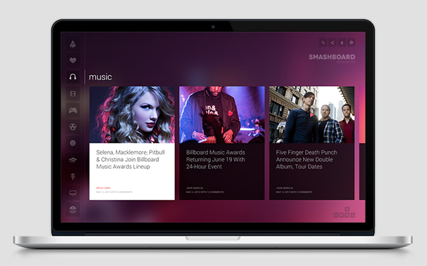
Sneak Peek1: Homepage

View the higher resolution Here
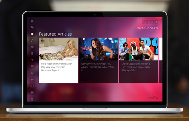
Sneak Peek 2: Featured Articles

View the higher resolution Here
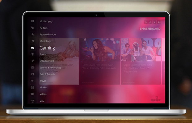
Sneak Peek 3: Category Page
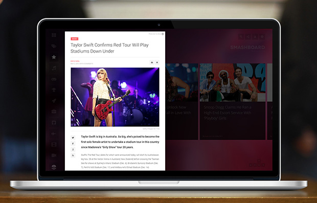
Sneak Peek 4: Item Detail Page
Let us know how you feel about this new concept.
LIVE DEMO (alpha) : CLICK HERE
8 users say Thank You to Hung Dinh for this useful post
swissa Friend
swissa
- Join date:
- November 2011
- Posts:
- 1955
- Downloads:
- 7
- Uploads:
- 277
- Thanks:
- 175
- Thanked:
- 717 times in 572 posts
Arvind Chauhan Moderator
Arvind Chauhan
- Join date:
- September 2014
- Posts:
- 3835
- Downloads:
- 74
- Uploads:
- 92
- Thanks:
- 1240
- Thanked:
- 1334 times in 848 posts
May 25, 2013 at 11:53 am #493943Live demo is up >> http://joomla25-templates.joomlart.com/ja_smashboard/
Please note its alpha.
Have a nice weekend guys!!
pedrox Friend
pedrox
- Join date:
- July 2007
- Posts:
- 375
- Downloads:
- 1
- Uploads:
- 85
- Thanks:
- 5
- Thanked:
- 37 times in 1 posts
May 25, 2013 at 3:39 pm #493956Sounds interesting…
Please, include extra provisions. Gallery, portfolio, blog … Only one provision appears to me too reductive
And include gallery (for articles or not)
And option for Facebook commentsThe navigation seems easy, but it should not be easy to find old things … seems to me a sort of bottomless hole, where everything falls is lost.
I like everything well organized and easy to find…And maybe include modules for Latest articles, Popular Articles, etc..
One position to the right for the Facebook module.Anyway, something more organized and social…
Thanks
pedrox Friend
pedrox
- Join date:
- July 2007
- Posts:
- 375
- Downloads:
- 1
- Uploads:
- 85
- Thanks:
- 5
- Thanked:
- 37 times in 1 posts
May 25, 2013 at 3:50 pm #493957And as always, K2 giving problems (See picture)
Why insist on using K2?? And why not Portfolio, for example??
Why insist on perpetuating the same problems from a template to another ???
I do not understand …-
1 user says Thank You to pedrox for this useful post
gringo211985 Friend
gringo211985
- Join date:
- May 2012
- Posts:
- 678
- Downloads:
- 197
- Uploads:
- 121
- Thanks:
- 77
- Thanked:
- 123 times in 27 posts
May 26, 2013 at 12:29 pm #493983WoW!!!! This looks amazing! I really hope that it will support VM2 because that would just make this template perfect and I love the way it’s designed for touch! Outstanding work again from JA team!
wombat1 Friend
wombat1
- Join date:
- March 2010
- Posts:
- 117
- Downloads:
- 0
- Uploads:
- 1
- Thanks:
- 38
- Thanked:
- 11 times in 1 posts
May 26, 2013 at 8:45 pm #493992So as Arvind says, it needs some work but so far this is excellent. Will likely be buying a new subscription just for this template.
I would also like to add my support for the comment above.
Stop with K2 already and do some more design and functionality work on standard Joomla articles and category layouts.
Now that Joomla 3.1 has tags, and Komento exists, there is no point in using K2 for just about anyone. Why design for a third party with almost nonexistent support and dodgy updating. It boggles the mind that template makers continue to support this product.If you can create double and triple column designs for Joomla tag layouts, Joomla will suddenly become a very different proposition for many.
Either way, it is always good to see development on templates that are beginning to take advantage of the possibilities available with html5 and bootstrap. It needs to be taken much further, but this is a great step in the right direction.
Good to see Joomlart doing work like this.
3 users say Thank You to wombat1 for this useful post
Arvind Chauhan Moderator
Arvind Chauhan
- Join date:
- September 2014
- Posts:
- 3835
- Downloads:
- 74
- Uploads:
- 92
- Thanks:
- 1240
- Thanked:
- 1334 times in 848 posts
May 27, 2013 at 8:32 am #494057<em>@pedrox 374287 wrote:</em><blockquote>Sounds interesting…
Please, include extra provisions. Gallery, portfolio, blog … Only one provision appears to me too reductive
And include gallery (for articles or not)
And option for Facebook commentsThe navigation seems easy, but it should not be easy to find old things … seems to me a sort of bottomless hole, where everything falls is lost.
I like everything well organized and easy to find…And maybe include modules for Latest articles, Popular Articles, etc..
One position to the right for the Facebook module.Anyway, something more organized and social…
Thanks</blockquote>
We are trying to have a vertical layout for components (3rd party extensions such as jomsocial, kunena etc… they do not look all that appealing in the current layout). The design concept of this template puts lots of restriction. We will know how its going to look (if easy to implement) in the next few days.
The template do have right side module position (activated by button on top right (top of logo) but was disabled in demo as it is work in progress.
If you guys have any specific module position in mind (not shown on demo), let us know.. we will try to implement it in the template but may not be included in the demo site.
Arvind
Arvind Chauhan Moderator
Arvind Chauhan
- Join date:
- September 2014
- Posts:
- 3835
- Downloads:
- 74
- Uploads:
- 92
- Thanks:
- 1240
- Thanked:
- 1334 times in 848 posts
May 27, 2013 at 8:35 am #494058<em>@wombat1 374347 wrote:</em><blockquote>So as Arvind says, it needs some work but so far this is excellent. Will likely be buying a new subscription just for this template.
I would also like to add my support for the comment above.
Stop with K2 already and do some more design and functionality work on standard Joomla articles and category layouts.
Now that Joomla 3.1 has tags, and Komento exists, there is no point in using K2 for just about anyone. Why design for a third party with almost nonexistent support and dodgy updating. It boggles the mind that template makers continue to support this product.If you can create double and triple column designs for Joomla tag layouts, Joomla will suddenly become a very different proposition for many.
Either way, it is always good to see development on templates that are beginning to take advantage of the possibilities available with html5 and bootstrap. It needs to be taken much further, but this is a great step in the right direction.
Good to see Joomlart doing work like this.</blockquote>
Good to hear from you wombat, happy to see a old member thinking of returning. PM me whenever you wish to renew, will restore the 30% renewal discount for you.
Cheers!
Arvind
Arvind Chauhan Moderator
Arvind Chauhan
- Join date:
- September 2014
- Posts:
- 3835
- Downloads:
- 74
- Uploads:
- 92
- Thanks:
- 1240
- Thanked:
- 1334 times in 848 posts
May 27, 2013 at 8:37 am #494059<em>@gringo211985 374333 wrote:</em><blockquote>WoW!!!! This looks amazing! I really hope that it will support VM2 because that would just make this template perfect and I love the way it’s designed for touch! Outstanding work again from JA team!</blockquote>
Based on the feedback from you guys, we are working to have a normal layout for 3rd party components, the current popup overlay for 3rd party extension may not work for all the extensions. But don’t ask for my blood if it proves to be difficult, the template concept does not allow flexibility.
Regards
Arvind
2 users say Thank You to Arvind Chauhan for this useful post
tfosnom Friend
tfosnom
- Join date:
- October 2010
- Posts:
- 742
- Downloads:
- 0
- Uploads:
- 31
- Thanks:
- 145
- Thanked:
- 200 times in 94 posts
May 27, 2013 at 11:03 am #494080<em>@wombat1 374347 wrote:</em><blockquote>So as Arvind says, it needs some work but so far this is excellent. I would also like to add my support for the comment above. Stop with K2 already. . . . Why design for a third party with almost nonexistent support and dodgy updating. It boggles the mind that template makers continue to support this product.
If you can create double and triple column designs for Joomla tag layouts, Joomla will suddenly become a very different proposition for many.
Good to see Joomlart doing work like this.</blockquote>
Agree re comments on K2, adding . . .
And yet JA and most users on the forum insist on styling for JomSocial which is bug ridden, is just one bug fix after another and seems to always be in Beta (being developed, revised or re developed, and has non existent support also
LOL
Shannontfosnom Friend
tfosnom
- Join date:
- October 2010
- Posts:
- 742
- Downloads:
- 0
- Uploads:
- 31
- Thanks:
- 145
- Thanked:
- 200 times in 94 posts
May 27, 2013 at 11:12 am #494084<em>@drarvindc 374422 wrote:</em><blockquote>Based on the feedback from you guys, we are working to have a normal layout for 3rd party components, the current popup overlay for 3rd party extension may not work for all the extensions. But don’t ask for my blood if it proves to be difficult, the template concept does not allow flexibility.
Regards
Arvind</blockquote>
Arvind, I know JA can’t please us all and it’s great to see some progress being made to produce a unique design. But given your “the template concept does not allow flexibility” comment. Wouldn’t it be better to say no to a lot of extra work on this 1 off design, and direct resources to something less difficult to modify, thus saving all those things that can go wrong and thousands of support questions that will follow?
Guess I’m saying you have presented something unique in form and function, get it working perfectly first of all and don’t destroy it’s look and feel by adding too much in the way of extras, know when in this case to stop and leave it alone?
Blessings Shannon2 users say Thank You to tfosnom for this useful post
Arvind Chauhan Moderator
Arvind Chauhan
- Join date:
- September 2014
- Posts:
- 3835
- Downloads:
- 74
- Uploads:
- 92
- Thanks:
- 1240
- Thanked:
- 1334 times in 848 posts
May 27, 2013 at 12:25 pm #494087<em>@tfosnom 374450 wrote:</em><blockquote>Arvind, I know JA can’t please us all and it’s great to see some progress being made to produce a unique design. But given your “the template concept does not allow flexibility” comment. Wouldn’t it be better to say no to a lot of extra work on this 1 off design, and direct resources to something less difficult to modify, thus saving all those things that can go wrong and thousands of support questions that will follow?
Guess I’m saying you have presented something unique in form and function, get it working perfectly first of all and don’t destroy it’s look and feel by adding too much in the way of extras, know when in this case to stop and leave it alone?
Blessings Shannon</blockquote>I agree shannon, the design concept will remain the same.. We are trying to get a better layout for the components layout.. be it registration, contact us and so on… so if it works well, it would be part of next demo update.
Regards
Arvind
1 user says Thank You to Arvind Chauhan for this useful post
gringo211985 Friend
gringo211985
- Join date:
- May 2012
- Posts:
- 678
- Downloads:
- 197
- Uploads:
- 121
- Thanks:
- 77
- Thanked:
- 123 times in 27 posts
May 27, 2013 at 12:33 pm #494088<em>@drarvindc 374422 wrote:</em><blockquote>Based on the feedback from you guys, we are working to have a normal layout for 3rd party components, the current popup overlay for 3rd party extension may not work for all the extensions. But don’t ask for my blood if it proves to be difficult, the template concept does not allow flexibility.
Regards
Arvind</blockquote>
No problem at all and thanks for considering the requests, the unique design is pretty amazing although you’ll never please everyone. I hope there is at least a standard/basic layout for VM or another shopping extension, doesn’t have to be amazing but just standard view with all correct coloured fonts etc would be perfect. I think it would be a shame if this template doesn’t have functionality with extensions like VM, Kuenena etc.
Anyway, you get my thumbs up for the layout and the designed for touch.
1 user says Thank You to gringo211985 for this useful post
Aratype Friend
Aratype
- Join date:
- August 2007
- Posts:
- 797
- Downloads:
- 41
- Uploads:
- 60
- Thanks:
- 194
- Thanked:
- 98 times in 6 posts
May 28, 2013 at 6:21 am #494149Wow, this is amazing!
I am wondering if it is worthy to do a version with 2/3 of article’s width and also to have the possibility to show the intro text after the title…
1 user says Thank You to Aratype for this useful post
AuthorPostsThis topic contains 40 replies, has 18 voices, and was last updated by
phong nam 11 years, 5 months ago.
We moved to new unified forum. Please post all new support queries in our New Forum


