-
AuthorPosts
-
gringo211985 Friend
gringo211985
- Join date:
- May 2012
- Posts:
- 678
- Downloads:
- 197
- Uploads:
- 121
- Thanks:
- 77
- Thanked:
- 123 times in 27 posts
November 11, 2014 at 7:14 pm #202639Hi guys,
Love the Uber template, I’ve already been chopping blocks from templates and sticking them into others with a lot of work but like how it’s being simplified. Allows us to make custom in much quicker time.
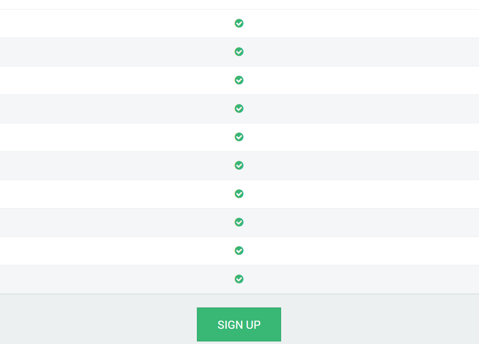
Anyway, the style 3 pricing table is completely broken on mobile and tablet views, let me show you.
and a little further down it looks like
and finally it looks like this at the bottom
This makes no sense to the average visitor and is a pain in the a** when you gotta scroll up n down to match it all up. Ideally it should look the same as the other 2 pricing tables when in mobile view so that people can easily see what it’s all about.
Although I think this is kind of a hard one to do, it does need changing as it’s useless to mobile and tablet atm imho.
Thanks,
Richard
Eragon H Friend
Eragon H
- Join date:
- July 2014
- Posts:
- 468
- Downloads:
- 1
- Uploads:
- 39
- Thanks:
- 5
- Thanked:
- 156 times in 149 posts
November 12, 2014 at 3:30 am #554920Hi Richard,
Thank you very much for your suggestion. I will pass this to the team for further checking on this
Best regards,
Eragon H
1 user says Thank You to Eragon H for this useful post
Css Magician Friend
Css Magician
- Join date:
- October 2014
- Posts:
- 741
- Downloads:
- 43
- Uploads:
- 53
- Thanks:
- 114
- Thanked:
- 366 times in 263 posts
November 13, 2014 at 3:47 am #555053@gringo211985, We fixed it and will update in upcoming version of Uber.
At this moment, you can download my attached file 41045 and extract to templatesuberacmpricingtmplstyle-3.php
1 user says Thank You to Css Magician for this useful post
gringo211985 Friend
gringo211985
- Join date:
- May 2012
- Posts:
- 678
- Downloads:
- 197
- Uploads:
- 121
- Thanks:
- 77
- Thanked:
- 123 times in 27 posts
November 15, 2014 at 3:03 pm #555297<em>@Css Magician 452878 wrote:</em><blockquote>@gringo211985, We fixed it and will update in upcoming version of Uber.
At this moment, you can download my attached file 41045 and extract to templatesuberacmpricingtmplstyle-3.php</blockquote>
Thanks guys, you’re the best!
AuthorPostsViewing 4 posts - 1 through 4 (of 4 total)This topic contains 4 replies, has 3 voices, and was last updated by
gringo211985 10 years, 2 months ago.
We moved to new unified forum. Please post all new support queries in our New Forum
Jump to forum
melih


