-
AuthorPosts
-
February 4, 2012 at 10:30 am #173533
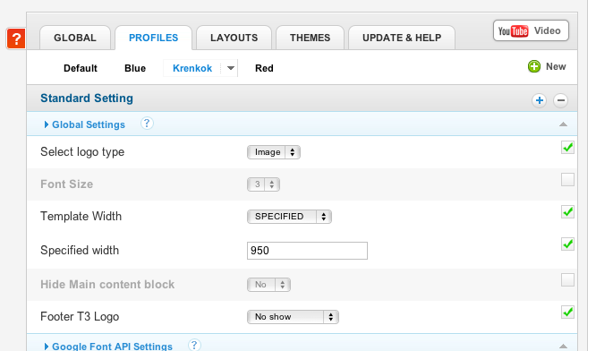
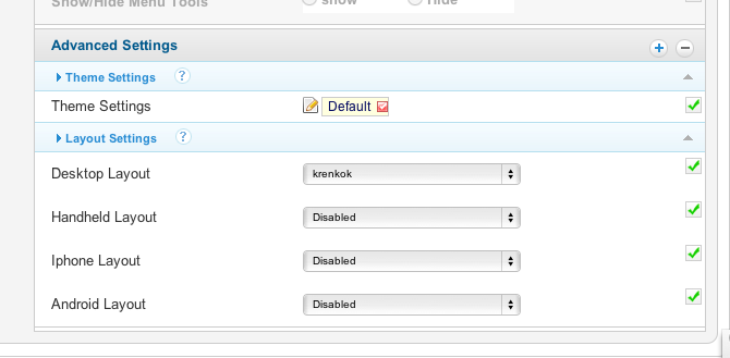
I have created at site from the blank ja_t3_blank template and have disabled the iphone, android and handheld layout, so that it should only show the desktop layout.
It also displays the desktop layout, but not correctly. On the ipad some of the right side is cut off and on the iphone I only see 1/3 of the site.
See attached images.
Any idea why this might be?
- February 14, 2012 at 8:39 am #438272
Hello, could anyone please help..
Thank you..
Juan Daniel Carretero Friend
Juan Daniel Carretero
- Join date:
- September 2014
- Posts:
- 17
- Downloads:
- 0
- Uploads:
- 1
- Thanks:
- 7
March 12, 2013 at 5:26 pm #486217Did you solve it? Thanks.
Stork11 Friend
Stork11
- Join date:
- March 2011
- Posts:
- 2273
- Downloads:
- 0
- Uploads:
- 142
- Thanks:
- 55
- Thanked:
- 431 times in 393 posts
March 13, 2013 at 4:22 am #486271Hello,
Please try to add below CSS code to “/templates/ja_t3_blank/css/template.css” file:
body#bd #ja-wrapper {
overflow: visible !important;
}Remember to clean site cache, then refresh front-end to see the result.
Regards.
AuthorPostsViewing 4 posts - 1 through 4 (of 4 total)This topic contains 4 replies, has 3 voices, and was last updated by
Stork11 11 years, 9 months ago.
We moved to new unified forum. Please post all new support queries in our New Forum
Jump to forum


