-
AuthorPosts
-
alessandro banini Friend
alessandro banini
- Join date:
- August 2013
- Posts:
- 44
- Downloads:
- 56
- Uploads:
- 6
- Thanks:
- 5
- Thanked:
- 1 times in 1 posts
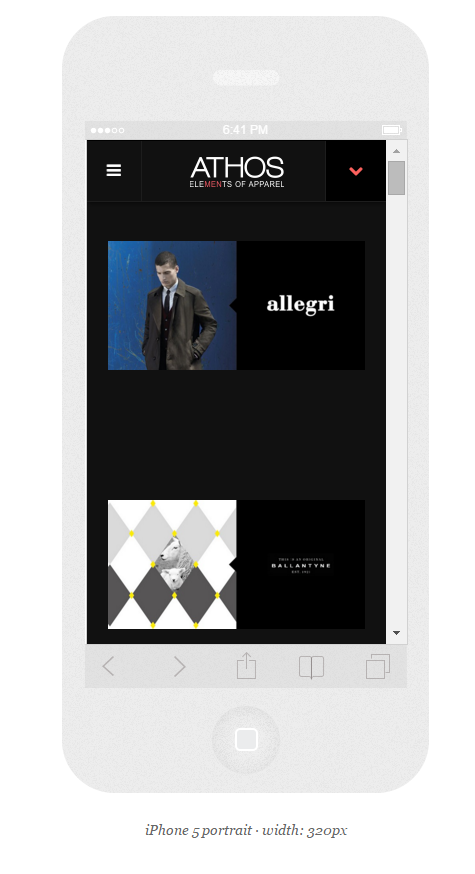
December 2, 2015 at 3:16 pm #759907hi, here with iphone 5 vertical view i have some problem. (2×1 align is not perfect)
http://www.athos-store.com/brands
with iphone 6 work fine
Saguaros Moderator
Saguaros
- Join date:
- September 2014
- Posts:
- 31405
- Downloads:
- 237
- Uploads:
- 471
- Thanks:
- 845
- Thanked:
- 5346 times in 4964 posts
December 3, 2015 at 3:51 am #760098Hi
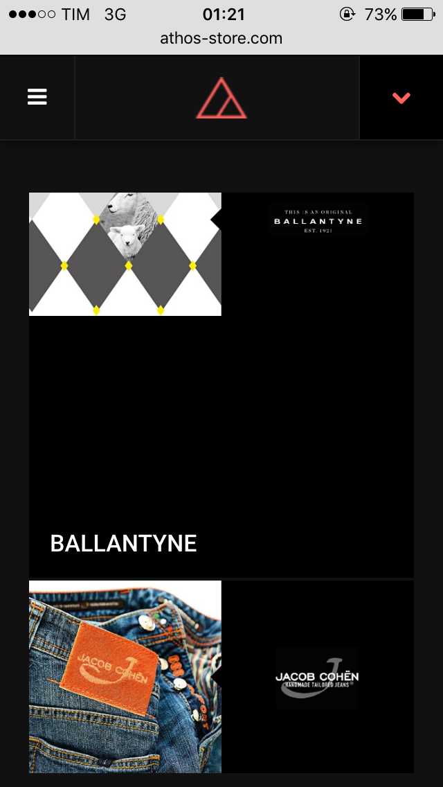
I view your site in iPhone 5 device but it looks good:
May I know how you want it should be?
alessandro banini Friend
alessandro banini
- Join date:
- August 2013
- Posts:
- 44
- Downloads:
- 56
- Uploads:
- 6
- Thanks:
- 5
- Thanked:
- 1 times in 1 posts
December 9, 2015 at 12:24 am #775135in the att my view in iphone 5 (too much space from the boxes), if you try with iphone 6 look better
Saguaros Moderator
Saguaros
- Join date:
- September 2014
- Posts:
- 31405
- Downloads:
- 237
- Uploads:
- 471
- Thanks:
- 845
- Thanked:
- 5346 times in 4964 posts
December 15, 2015 at 2:32 am #813919Hi amok360,
Not sure why you get this issue, how did you install this template?
You can try adding this css rule:
.fixel-grid .items {
    height: 142px !important;
}
into the file: **root/templates/ja_fixel/css/custom.css (create this file if it doesn’t exist)
Regards
alessandro banini Friend
alessandro banini
- Join date:
- August 2013
- Posts:
- 44
- Downloads:
- 56
- Uploads:
- 6
- Thanks:
- 5
- Thanked:
- 1 times in 1 posts
December 20, 2015 at 5:31 pm #825638installed from quick start, and i also try to override all the template files to exclude any file loss.
BUT , no way, also now with your custom.css – if i add the custom all the grid become compressed.
everywhere without in the iphone 5.please help me to fine a solution.
open the page http://www.athos-store.com/brands with iphone 5 and with iphon 6. it look different.the page in brands is generate by Fixel Category Blog menu
alessandro banini Friend
alessandro banini
- Join date:
- August 2013
- Posts:
- 44
- Downloads:
- 56
- Uploads:
- 6
- Thanks:
- 5
- Thanked:
- 1 times in 1 posts
December 20, 2015 at 5:45 pm #825641inside here there are the 2 comparation:
iphone 5 + iphne 6 (vertical and horizonthal)http://www.responsinator.com/?url=athos-store.com%2Fbrands
looks like problems with width under 370px

Saguaros Moderator
Saguaros
- Join date:
- September 2014
- Posts:
- 31405
- Downloads:
- 237
- Uploads:
- 471
- Thanks:
- 845
- Thanked:
- 5346 times in 4964 posts
December 21, 2015 at 7:27 am #826647You can send me the Admin & FTP account of your site via reply and SET IT AS PRIVATE reply (so that only Moderators and Staffs can see), I will check it for you.
alessandro banini Friend
alessandro banini
- Join date:
- August 2013
- Posts:
- 44
- Downloads:
- 56
- Uploads:
- 6
- Thanks:
- 5
- Thanked:
- 1 times in 1 posts
December 21, 2015 at 9:24 am #826749This reply has been marked as private.alessandro banini Friend
alessandro banini
- Join date:
- August 2013
- Posts:
- 44
- Downloads:
- 56
- Uploads:
- 6
- Thanks:
- 5
- Thanked:
- 1 times in 1 posts
December 23, 2015 at 9:48 am #829770news?
Saguaros Moderator
Saguaros
- Join date:
- September 2014
- Posts:
- 31405
- Downloads:
- 237
- Uploads:
- 471
- Thanks:
- 845
- Thanked:
- 5346 times in 4964 posts
December 24, 2015 at 4:40 am #830423You did NOT add css as my suggestion above.
I just added for you and it works now.
alessandro banini Friend
alessandro banini
- Join date:
- August 2013
- Posts:
- 44
- Downloads:
- 56
- Uploads:
- 6
- Thanks:
- 5
- Thanked:
- 1 times in 1 posts
December 26, 2015 at 4:54 pm #832133No. because if you add that changes. you go to BROKE all the other pages.
check the home for example by any mobile device.Saguaros Moderator
Saguaros
- Join date:
- September 2014
- Posts:
- 31405
- Downloads:
- 237
- Uploads:
- 471
- Thanks:
- 845
- Thanked:
- 5346 times in 4964 posts
December 27, 2015 at 2:18 pm #832460I changed it to:
@media screen and (max-width: 320px) {
.itemid-489 .fixel-grid .items {
    height: 142px !important;
}
}
and it seems to be fine now, kindly take a look.
alessandro banini Friend
alessandro banini
- Join date:
- August 2013
- Posts:
- 44
- Downloads:
- 56
- Uploads:
- 6
- Thanks:
- 5
- Thanked:
- 1 times in 1 posts
December 28, 2015 at 1:55 pm #833208think is ok now 🙂
AuthorPostsViewing 13 posts - 1 through 13 (of 13 total)This topic contains 12 replies, has 2 voices, and was last updated by
alessandro banini 8 years, 10 months ago.
We moved to new unified forum. Please post all new support queries in our New Forum
Jump to forum


