-
AuthorPosts
-
 Pankaj Sharma
Moderator
Pankaj Sharma
- Join date:
- February 2015
- Posts:
- 24589
- Downloads:
- 144
- Uploads:
- 202
- Thanks:
- 127
- Thanked:
- 4196 times in 4019 posts
November 21, 2016 at 4:52 pm #988278bobptz Friend
bobptz
- Join date:
- November 2016
- Posts:
- 178
- Downloads:
- 8
- Uploads:
- 19
- Thanks:
- 1
- Thanked:
- 1 times in 1 posts
November 21, 2016 at 5:42 pm #988296Hello
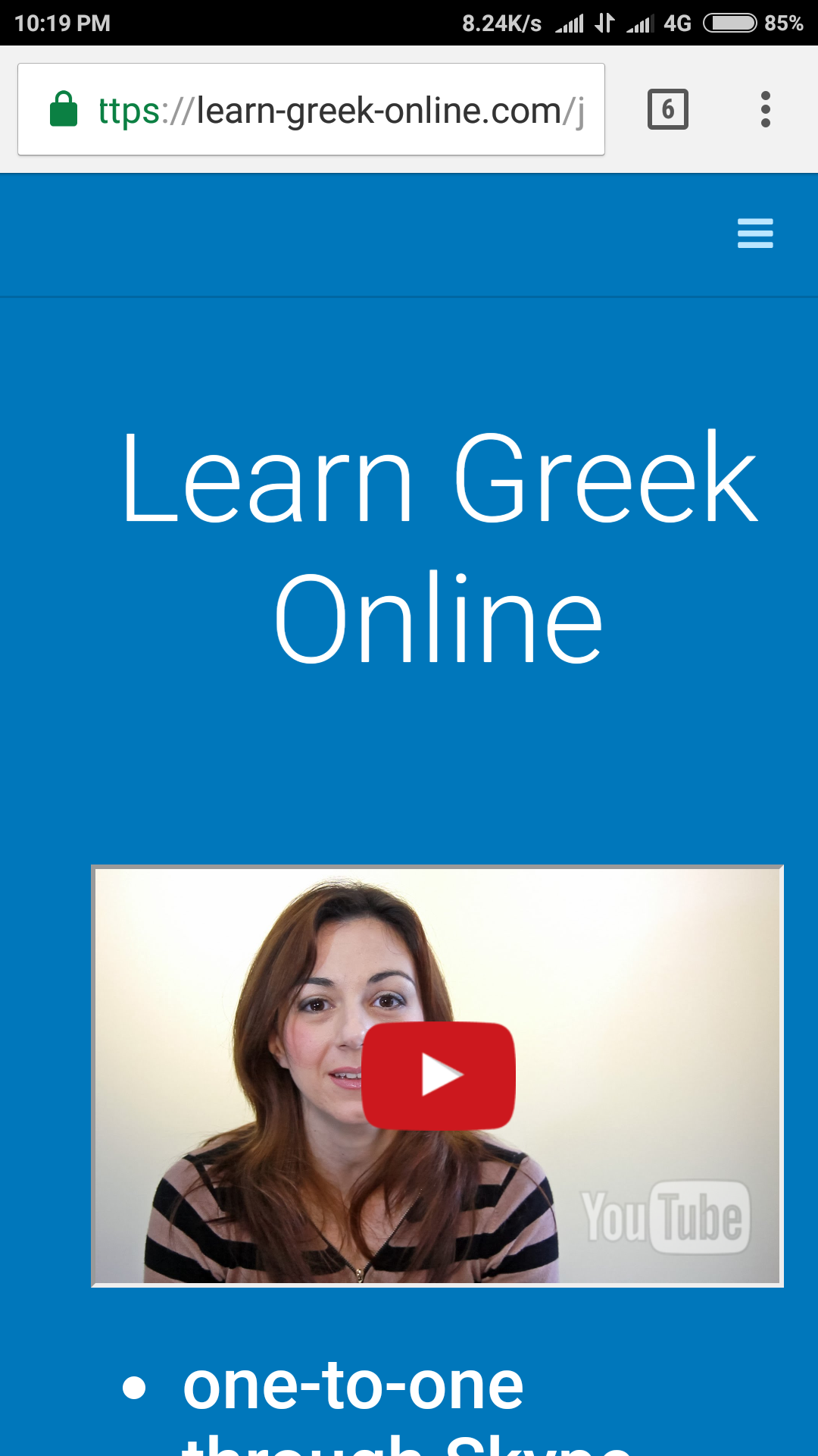
I did test with a 5" screen real device and it looks ok (for this particular string).
1) However for a 4" screen (tested through a scrren simulator, like http://whatismyscreenresolution.net, it is as I initially reported).
2) I increased the size of the caption of the button. Now the masthead is easily corrupted even on my 5.5" smartphone.
3) When the masthead becomes corrupted in certain browser window sizes, this is not considered to be a problem?
The solution would be to allow the caption of the button to wrap, just as normal text, when the screen is narrow.
I am sure I can find a way to fix it if I play with the CSS. I just thought it would be usefull for you too know.
 Pankaj Sharma
Moderator
Pankaj Sharma
- Join date:
- February 2015
- Posts:
- 24589
- Downloads:
- 144
- Uploads:
- 202
- Thanks:
- 127
- Thanked:
- 4196 times in 4019 posts
November 22, 2016 at 1:59 am #988391Hi
You have this code in the module :<div class="btn-action" style="margin-bottom: 20px;"> <p><a href="https://learn-greek-online.com/joomdev/free-lesson.html" class="btn btn-success btn-lg">Take a Free Lesson Now, addded some very long text here</a></p> </div>for the button
replace it with<div class="btn-action" style="margin-bottom: 20px;"> <p><a href="https://learn-greek-online.com/joomdev/free-lesson.html" class="btn btn-success btn-lg" style=" white-space: normal; ">Take a Free Lesson Now, addded some very long text here</a></p> </div>Added style white-space: normal; .
It will fix the issue .bobptz Friend
bobptz
- Join date:
- November 2016
- Posts:
- 178
- Downloads:
- 8
- Uploads:
- 19
- Thanks:
- 1
- Thanked:
- 1 times in 1 posts
November 22, 2016 at 7:04 am #988456It is fixed! Thank you very much.
AuthorPostsViewing 4 posts - 1 through 4 (of 4 total)This topic contains 4 replies, has 2 voices, and was last updated by
bobptz 8 years ago.
The topic ‘Problem with masthead’ is closed to new replies.
Problem with masthead
Viewing 4 posts - 1 through 4 (of 4 total)


