-
AuthorPosts
-
wbroda Friend
wbroda
- Join date:
- September 2012
- Posts:
- 49
- Downloads:
- 48
- Uploads:
- 11
- Thanks:
- 18
- Thanked:
- 3 times in 1 posts
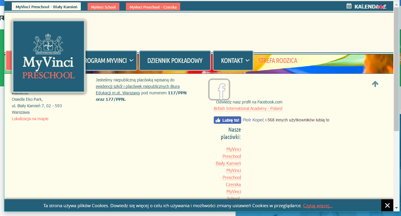
November 25, 2016 at 2:51 pm #989744Hello, I’d like to ask for a solution to this problem I encountered: It seems the template works well on most resolutions, but it goes weird on my site in the resolutions: 1024×600 and 1024×768. The problem seems to be present between the 991px to 1072px width, when the logo image appears as the large menu, but the menu doesn’t shift to the right like it’s supposed to. Can you give me a solution? I know it must be something with the media resolution definitions – probably of the menu, but nothing I’ve tried until now fixed it.
How can I fix it?
http://www.myvinci.edu.pl/startSaguaros Moderator
Saguaros
- Join date:
- September 2014
- Posts:
- 31405
- Downloads:
- 237
- Uploads:
- 471
- Thanks:
- 845
- Thanked:
- 5346 times in 4964 posts
November 28, 2016 at 2:56 pm #990471Hi,
Could you update the credentials of your site i.e: admin & FTP account of your site?
wbroda
- Join date:
- September 2012
- Posts:
- 49
- Downloads:
- 48
- Uploads:
- 11
- Thanks:
- 18
- Thanked:
- 3 times in 1 posts
November 28, 2016 at 3:30 pm #990495Hi, I found a roundabout way that seems to work for now – not sure if it’s ok on Apple iPads, I will test it shortly.
I added the following code to my custom.css file. Can you please tell me if this should be enough or can it mess up anything?@media (min-width: 992px) and (max-width: 1072px) { .navbar-nav { margin: 0; left: 226px; display: block; position: relative; top: -54px; } }Saguaros
- Join date:
- September 2014
- Posts:
- 31405
- Downloads:
- 237
- Uploads:
- 471
- Thanks:
- 845
- Thanked:
- 5346 times in 4964 posts
November 29, 2016 at 8:34 am #990780It’s a nice try!!
AuthorPostsViewing 4 posts - 1 through 4 (of 4 total)This topic contains 3 replies, has 2 voices, and was last updated by
Saguaros 8 years ago.
We moved to new unified forum. Please post all new support queries in our New Forum
Problem with responsive resolution 1024×600 and 1024×768 landscape
Viewing 4 posts - 1 through 4 (of 4 total)