-
AuthorPosts
-
March 19, 2013 at 12:11 am #185967
I am having problems with the logo that I have replaced on the JA Zite template. Having read all the posts in the JA Zite forum, I think it is a result of the responsiveness features of the template.
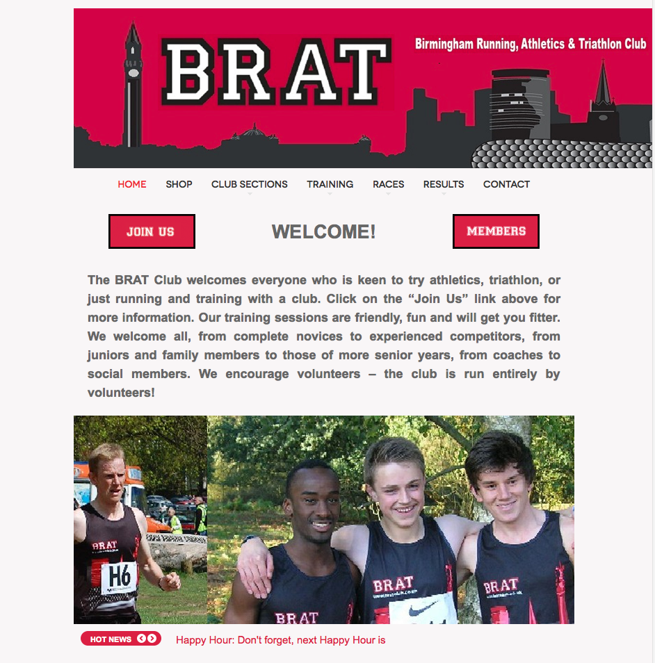
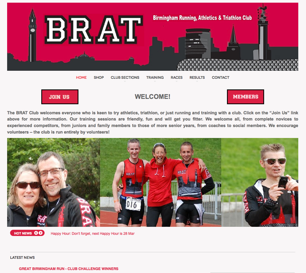
The attached screenshots show what I mean:
Screen 1 is what I want the site to look like, with the logo and the rest of the content lined up.
Screen 2 is what I see when I reduce the browser window down (and also when I look at it on an ipad).
Screen 3 is what I see when I reduce the browser window down still further (and also what I see on an iphone).
My problem is that on screen 2 you can see the logo is not resized and so the right border does not line up with the rest of the site, which has been resized.
On screen 3 the logo is resized but now the right border is wider than the rest of the site.
I thought perhaps I could disable the responsiveness, by removing these lines:
<file media=”only screen and (max-width:719px)”>css/layout-mobile.css</file>
<file media=”only screen and (max-width:479px)”>css/layout-mobile-port.css</file>
<file media=”only screen and (min-width:720px) and (max-width: 985px)”>css/layout-tablet.css</file>
<file media=”only screen and (min-width:986px) and (max-width: 1235px)”>css/layout-normal.css</file>from my layout files. However this did not change anything. I can tell from Firebug that the settings in these files are still being used. I have cleared the JAT3 cache and site-wide caching is not turned on. Obviously CSS optimize is turned off too.
Can someone help me either turn off responsiveness or change the responsiveness so it resizes all screen elements including logo?
Thanks

 Ninja Lead
Moderator
Ninja Lead
- Join date:
- November 2014
- Posts:
- 16064
- Downloads:
- 310
- Uploads:
- 2864
- Thanks:
- 341
- Thanked:
- 3854 times in 3563 posts
March 19, 2013 at 9:37 am #487003Can you send me URL on your site with Compress CSS optimize is turned off, I shall check it on device your mention and fix it for you
March 19, 2013 at 2:18 pm #487040I still don’t know how to turn off the responsiveness and I still don’t know why a responsive template doesn’t have all elements working in the same way. However I think I have resolved my problem so for those who also want to make the logo responsive, as well as all the rest of the elements on the page (not sure why it isn’t anyway) then I think this should work:
In template.css and layout-tablet.css I changed the specific size definitions for the logo to be in percentage terms:
e.g.
h1.logo {margin: 0 auto; width: 980px;}
becomes:
h1.logo {margin: 0 auto; width: 100%;}
I’ve no idea if this is the best way to do it. I’m no expert, but I need a solution so this will do for me.
 Ninja Lead
Moderator
Ninja Lead
- Join date:
- November 2014
- Posts:
- 16064
- Downloads:
- 310
- Uploads:
- 2864
- Thanks:
- 341
- Thanked:
- 3854 times in 3563 posts
March 20, 2013 at 10:41 am #487188However, it still seems to be difficult for me to guess the issue and give out the solution if I do not have a look at it. So, could you please let me know your site URL of the problems with Compress CSS optimize is turned off ? I will check it for you.
Look forward to hearing from you
AuthorPostsViewing 4 posts - 1 through 4 (of 4 total)This topic contains 4 replies, has 2 voices, and was last updated by
 Ninja Lead 11 years, 6 months ago.
We moved to new unified forum. Please post all new support queries in our New Forum
Jump to forum


