-
AuthorPosts
-
 jeannine
Friend
jeannine
- Join date:
- May 2014
- Posts:
- 76
- Downloads:
- 4
- Uploads:
- 9
- Thanks:
- 30
- Thanked:
- 2 times in 2 posts
January 25, 2016 at 1:04 pm #867716Hello,
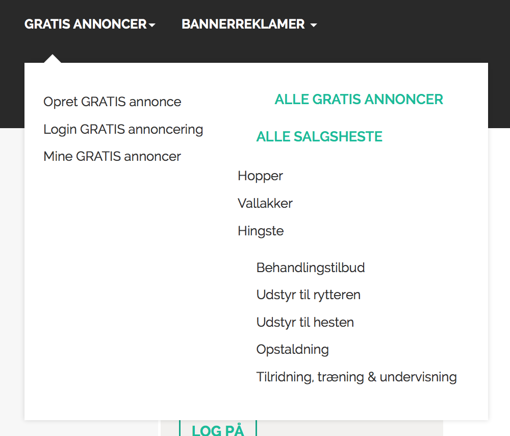
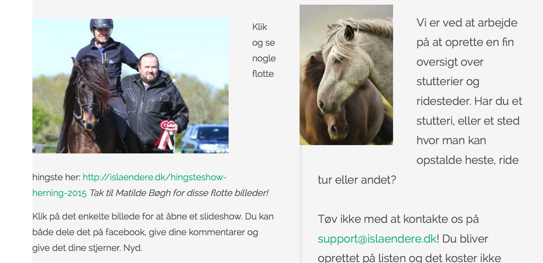
I experience problems with blog view, when I have 2 articles in a row. http://islaendere.dk/islandshesten Form fields in mobile layout are not shown nicely
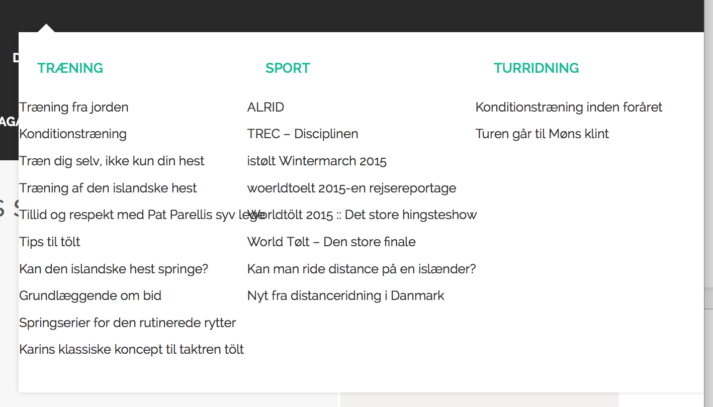
There are as well problems with the mega drop down. It is not nice.
See attachments

Adam M Moderator
Adam M
- Join date:
- May 2014
- Posts:
- 5159
- Downloads:
- 33
- Uploads:
- 66
- Thanks:
- 95
- Thanked:
- 1271 times in 1235 posts
 jeannine
Friend
jeannine
- Join date:
- May 2014
- Posts:
- 76
- Downloads:
- 4
- Uploads:
- 9
- Thanks:
- 30
- Thanked:
- 2 times in 2 posts
February 6, 2016 at 9:40 pm #878114Hello again, I do still experience problems with the input fields. you can see it here: http://islaendere.dk/2015-08-26-10-09-09/gratis-annoncer
and also on mobile view in sidebar fx here: http://islaendere.dk/praktisk-videnAlso I do not understand how to make the facebook login button look like template design button, see attached. Just with text: Log ind med facebook
Adam M Moderator
Adam M
- Join date:
- May 2014
- Posts:
- 5159
- Downloads:
- 33
- Uploads:
- 66
- Thanks:
- 95
- Thanked:
- 1271 times in 1235 posts
 jeannine
Friend
jeannine
- Join date:
- May 2014
- Posts:
- 76
- Downloads:
- 4
- Uploads:
- 9
- Thanks:
- 30
- Thanked:
- 2 times in 2 posts
February 15, 2016 at 10:13 am #883379Hello Adam,
I have edited my first post and the required information 🙂
Adam M Moderator
Adam M
- Join date:
- May 2014
- Posts:
- 5159
- Downloads:
- 33
- Uploads:
- 66
- Thanks:
- 95
- Thanked:
- 1271 times in 1235 posts
February 15, 2016 at 4:19 pm #883667Hi @jeannine,
Thanks for the info.
- First, the login module in demo site is default Joomla! login module, you can find the instruction for this part here (scroll down to section 5. Login). The module you’re using is Facebookall Login which is 3rd party extension so you will need to customize the module in order to get the same design as in demo which is out of support scope. There’s a small alignment issue with the module and you can fix it by adding this code to custom.css file :
#login-form #form-login-remember #modlgn-remember { height: auto; vertical-align: top; } -
Also in this page, the module wasn’t designed to display in such position so you will get the problem with layout.
- The text in Facebookall Login login button is hard-code in the module code so please contact its developer about how to change the text and reply back here, I will assist you in styling part.
 jeannine
Friend
jeannine
- Join date:
- May 2014
- Posts:
- 76
- Downloads:
- 4
- Uploads:
- 9
- Thanks:
- 30
- Thanked:
- 2 times in 2 posts
February 15, 2016 at 6:12 pm #883755Hello Adam, Oh, I understand. Thank you so much for helping me. Will you have a look at the input fields? They are from joomla login form and they look strange, both on desktop and mobile view.
Thanks again.
Adam M Moderator
Adam M
- Join date:
- May 2014
- Posts:
- 5159
- Downloads:
- 33
- Uploads:
- 66
- Thanks:
- 95
- Thanked:
- 1271 times in 1235 posts
February 16, 2016 at 3:43 am #883963Hi @jeannine,
Actually it’s not related to our template but the CSS rule from Ads Manager caused this problem. I logged in to your site and fixed them both for you.
-
About the login form, I created a HTML override in templates/ja_sugite/html/mod_facebookall_login
- The new CSS rule to style login form has been put at the end of file templates/ja_sugite/css/custom.css
 jeannine
Friend
jeannine
- Join date:
- May 2014
- Posts:
- 76
- Downloads:
- 4
- Uploads:
- 9
- Thanks:
- 30
- Thanked:
- 2 times in 2 posts
February 16, 2016 at 7:23 am #884114Thank you sooo much! I am very happy now! 🙂 Great support!
Adam M Moderator
Adam M
- Join date:
- May 2014
- Posts:
- 5159
- Downloads:
- 33
- Uploads:
- 66
- Thanks:
- 95
- Thanked:
- 1271 times in 1235 posts
AuthorPostsViewing 10 posts - 1 through 10 (of 10 total)This topic contains 9 replies, has 2 voices, and was last updated by
Adam M 8 years, 10 months ago.
We moved to new unified forum. Please post all new support queries in our New Forum
Jump to forum


