-
AuthorPosts
-
July 17, 2008 at 7:58 pm #131001
1. How can I reduce the amount of space between the different poll options / radio buttons? There is currently more white space between then than I would like.
2. Also, is there a way to change the color of the Poll header bar (ie. the bar that separated the poll from the other modules on the left side of the screen.
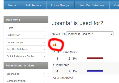
3. Finally, on the poll results page, there is a tiny bar graph icon. How can I get rid of this completely? Not sure what it’s function is supposed to be but its too small to be meaningful.
URL is http://74.54.218.226/~gilmore/
Thanks!
Sherlock Friend
Sherlock
- Join date:
- September 2014
- Posts:
- 11453
- Downloads:
- 0
- Uploads:
- 88
- Thanks:
- 221
- Thanked:
- 2478 times in 2162 posts
July 18, 2008 at 7:46 am #260650Hi
1. space between option/radio button:
You can edit template.css (line 264)
table.pollstableborder td {

background:transparent none repeat scroll 0% 0%;

border-collapse:collapse;

border-spacing:0pt;

padding:4px !important; -> change here

}
1 user says Thank You to Sherlock for this useful post
Sherlock Friend
Sherlock
- Join date:
- September 2014
- Posts:
- 11453
- Downloads:
- 0
- Uploads:
- 88
- Thanks:
- 221
- Thanked:
- 2478 times in 2162 posts
July 18, 2008 at 7:50 am #2606522.Change color header of Poll module
You must go to admin, Extensions-> module manager, choose Poll module to edit, add class suffix for Poll module, example as “-poll”
then please add code to template.css like this
div.moduletable-poll {

// add your css here

}
and
div.moduletable-poll h3 {

//add your css here

}
…
Now Edenite support _text, _hilite suffix for module, you can use them1 user says Thank You to Sherlock for this useful post
Sherlock Friend
Sherlock
- Join date:
- September 2014
- Posts:
- 11453
- Downloads:
- 0
- Uploads:
- 88
- Thanks:
- 221
- Thanked:
- 2478 times in 2162 posts
July 18, 2008 at 7:52 am #2606533. plz make screenshots
July 22, 2008 at 5:46 am #261320July 22, 2008 at 6:10 am #261321For some reason, when I changed the spacing, the poll options are now centered instead of justified left and I can’t figure out what I did to cause that.
Any ideas?
Thanks!
Sherlock Friend
Sherlock
- Join date:
- September 2014
- Posts:
- 11453
- Downloads:
- 0
- Uploads:
- 88
- Thanks:
- 221
- Thanked:
- 2478 times in 2162 posts
July 22, 2008 at 6:49 am #2613273. you can disable that image by edit template.css (line 260)
table.pollstableborder img {

vertical-align:baseline;

}
to
table.pollstableborder img {

vertical-align:baseline;

display:none;

}
Sherlock Friend
Sherlock
- Join date:
- September 2014
- Posts:
- 11453
- Downloads:
- 0
- Uploads:
- 88
- Thanks:
- 221
- Thanked:
- 2478 times in 2162 posts
July 22, 2008 at 7:13 am #261331<blockquote>For some reason, when I changed the spacing, the poll options are now centered instead of justified left and I can’t figure out what I did to cause that.
Any ideas?
Thanks!</blockquote>
You can add those lines at the end of template.css
div.moduletable_hilite table {margin-left:-5px;
}
You can change -5px as you wantJuly 22, 2008 at 6:17 pm #261552I added the code
div.moduletable_hilite table {margin-left:-5px;
}to the end of my template.css.
In Internet Explorer 7, the poll options are still centered instead of justified left against the radio buttons. They look correct in Firefox…
August 4, 2008 at 5:04 pm #263780I think my last question got buried in the other requests.
TWO question:
1) In Internet Explorer 7, the poll options are still centered instead of justified left against the radio buttons. They look correct in Firefox…
2) Where can increase the height of the poll results colored bars?THanks!
AuthorPostsViewing 10 posts - 1 through 10 (of 10 total)This topic contains 10 replies, has 2 voices, and was last updated by
stewarttodd 16 years, 5 months ago.
We moved to new unified forum. Please post all new support queries in our New Forum
Reduce space between Poll options?
Viewing 10 posts - 1 through 10 (of 10 total)


