-
AuthorPosts
-
vinkers Friend
vinkers
- Join date:
- December 2012
- Posts:
- 19
- Downloads:
- 0
- Uploads:
- 16
- Thanks:
- 1
- Thanked:
- 1 times in 1 posts
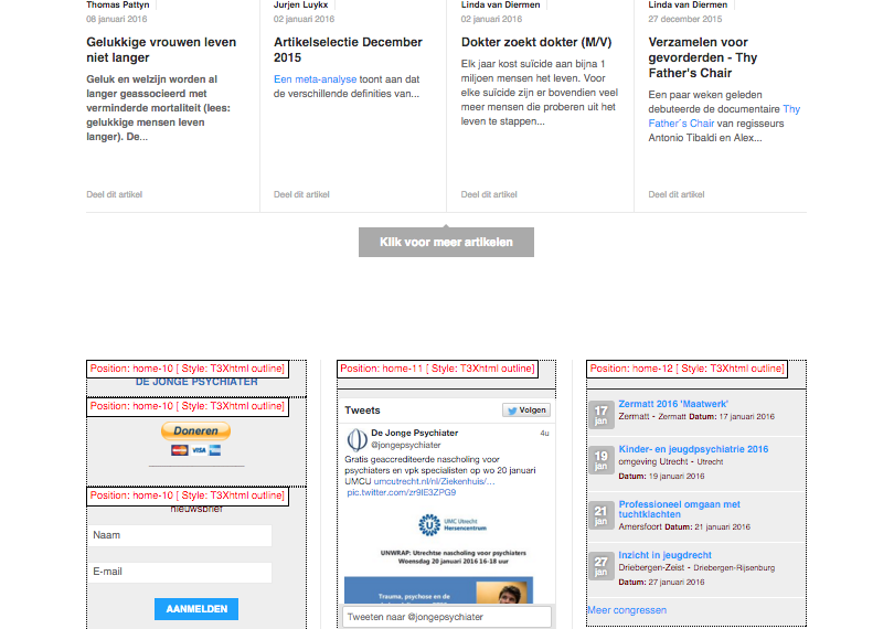
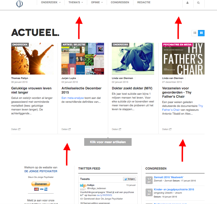
January 10, 2016 at 8:02 pm #843065Is it possible to reduce the white space between the button "Klik voor meer artikelen’ and the modules on positions Home-10, 11 and 12?
And is it possible to remove the thin line and space above ‘Actueel.’?
See attachments.
-
pavit Moderator
pavit
- Join date:
- September 2007
- Posts:
- 15749
- Downloads:
- 199
- Uploads:
- 2274
- Thanks:
- 417
- Thanked:
- 4028 times in 3778 posts
January 11, 2016 at 10:30 am #844010Hi
Could you post a link to your website ?
you can use the private reply eventually.vinkers Friend
vinkers
- Join date:
- December 2012
- Posts:
- 19
- Downloads:
- 0
- Uploads:
- 16
- Thanks:
- 1
- Thanked:
- 1 times in 1 posts
January 11, 2016 at 11:46 am #844062This reply has been marked as private.pavit Moderator
pavit
- Join date:
- September 2007
- Posts:
- 15749
- Downloads:
- 199
- Uploads:
- 2274
- Thanks:
- 417
- Thanked:
- 4028 times in 3778 posts
January 12, 2016 at 6:44 am #845207Hi there
I created a new file in your css folder and named it custom.css with these css code
.tpl-inf-wrapper h1 {
  background:none!important;
}
.t3-mainbody {
  padding-bottom:0px!important;
}
Check your page now
Best regards
vinkers Friend
vinkers
- Join date:
- December 2012
- Posts:
- 19
- Downloads:
- 0
- Uploads:
- 16
- Thanks:
- 1
- Thanked:
- 1 times in 1 posts
January 12, 2016 at 9:38 pm #846073Yes, that looks better. Thank you.
vinkers Friend
vinkers
- Join date:
- December 2012
- Posts:
- 19
- Downloads:
- 0
- Uploads:
- 16
- Thanks:
- 1
- Thanked:
- 1 times in 1 posts
January 17, 2016 at 5:28 pm #850651Not all the white space has been removed. I think it’s still too much.
Is it possible to reduce it more?
See attachment.
pavit Moderator
pavit
- Join date:
- September 2007
- Posts:
- 15749
- Downloads:
- 199
- Uploads:
- 2274
- Thanks:
- 417
- Thanked:
- 4028 times in 3778 posts
January 17, 2016 at 7:09 pm #850774Add this to your custom.css
.view-featured .tpl-inf-wrapper {
padding-bottom:0px!important;
}

.t3-mainbody {
  padding-bottom:0px!important;
  margin-top:-50px!important;
}
vinkers Friend
vinkers
- Join date:
- December 2012
- Posts:
- 19
- Downloads:
- 0
- Uploads:
- 16
- Thanks:
- 1
- Thanked:
- 1 times in 1 posts
January 18, 2016 at 8:50 pm #852004Thank you.
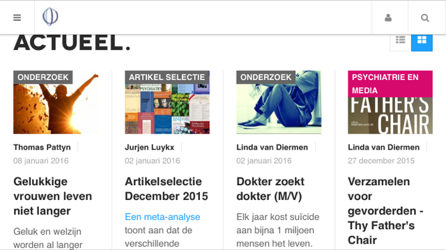
The frontpage now looks better on desktop, but on iPhone there’s now too little white space on top.
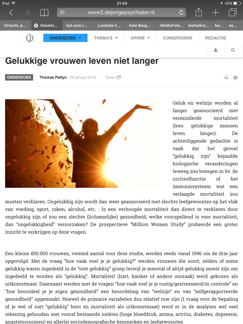
And when you open an article the title of the article is too high on all devices (desktop, iPad and iPhone).
See attachments.
I hope you can make the adjustments more specific.
Thank you in advance.

pavit Moderator
pavit
- Join date:
- September 2007
- Posts:
- 15749
- Downloads:
- 199
- Uploads:
- 2274
- Thanks:
- 417
- Thanked:
- 4028 times in 3778 posts
January 20, 2016 at 6:52 am #862489The super user account you provided is blocked
restore it so i can take a look at your files and answer to your questions
Regards
vinkers Friend
vinkers
- Join date:
- December 2012
- Posts:
- 19
- Downloads:
- 0
- Uploads:
- 16
- Thanks:
- 1
- Thanked:
- 1 times in 1 posts
January 21, 2016 at 4:26 pm #864535This reply has been marked as private.pavit Moderator
pavit
- Join date:
- September 2007
- Posts:
- 15749
- Downloads:
- 199
- Uploads:
- 2274
- Thanks:
- 417
- Thanked:
- 4028 times in 3778 posts
January 22, 2016 at 4:07 pm #865505Hi
You need to use in your custom.css media query to correctly fix the space between your positions , this is out of the template support since it is a template customization , i showed how to do , you can now do it follow media query documentation provided
AuthorPostsViewing 11 posts - 1 through 11 (of 11 total)This topic contains 10 replies, has 2 voices, and was last updated by
pavit 8 years, 10 months ago.
We moved to new unified forum. Please post all new support queries in our New Forum
Jump to forum
Reduce white space between modules
Viewing 11 posts - 1 through 11 (of 11 total)


