-
AuthorPosts
-
James G Friend
James G
- Join date:
- September 2014
- Posts:
- 130
- Downloads:
- 104
- Uploads:
- 4
- Thanks:
- 20
- Thanked:
- 40 times in 6 posts
December 18, 2015 at 10:22 am #820002Hi,
I have done a search and come across this post: https://www.joomlart.com/forums/topic/table-appearance-in-responsive-mode/#post-471630 – I am guessing they suffered the same issue as me?
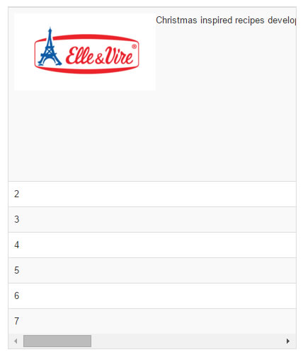
The table works fine on a normal screen but if you look at it on a mobile device or resize the screen the text all goes onto one like thus making the column go on forever if you have a load of text.
I have attached a screenshot to show what i mean. I’m guessing this may be a CSS fix but i’ve spent too much time already trying to resolve it so hoping for help.
The table is basically too big on mobile version. I already set the 4 columns to 25% which worked well but how can we shrink the table on mobile view so the column is smaller or the text wraps?
Thanks
Saguaros Moderator
Saguaros
- Join date:
- September 2014
- Posts:
- 31405
- Downloads:
- 237
- Uploads:
- 471
- Thanks:
- 845
- Thanked:
- 5346 times in 4964 posts
December 21, 2015 at 10:30 am #826804Hi James,
You’re right, it will require lots of CSS styles for responsive table, I also give some references in that topic, did you try with that?
AuthorPostsViewing 2 posts - 1 through 2 (of 2 total)This topic contains 1 reply, has 2 voices, and was last updated by
Saguaros 9 years ago.
We moved to new unified forum. Please post all new support queries in our New Forum
Responsive Table not working
Viewing 2 posts - 1 through 2 (of 2 total)


