-
AuthorPosts
-
January 13, 2017 at 8:36 am #1002047
Hello,
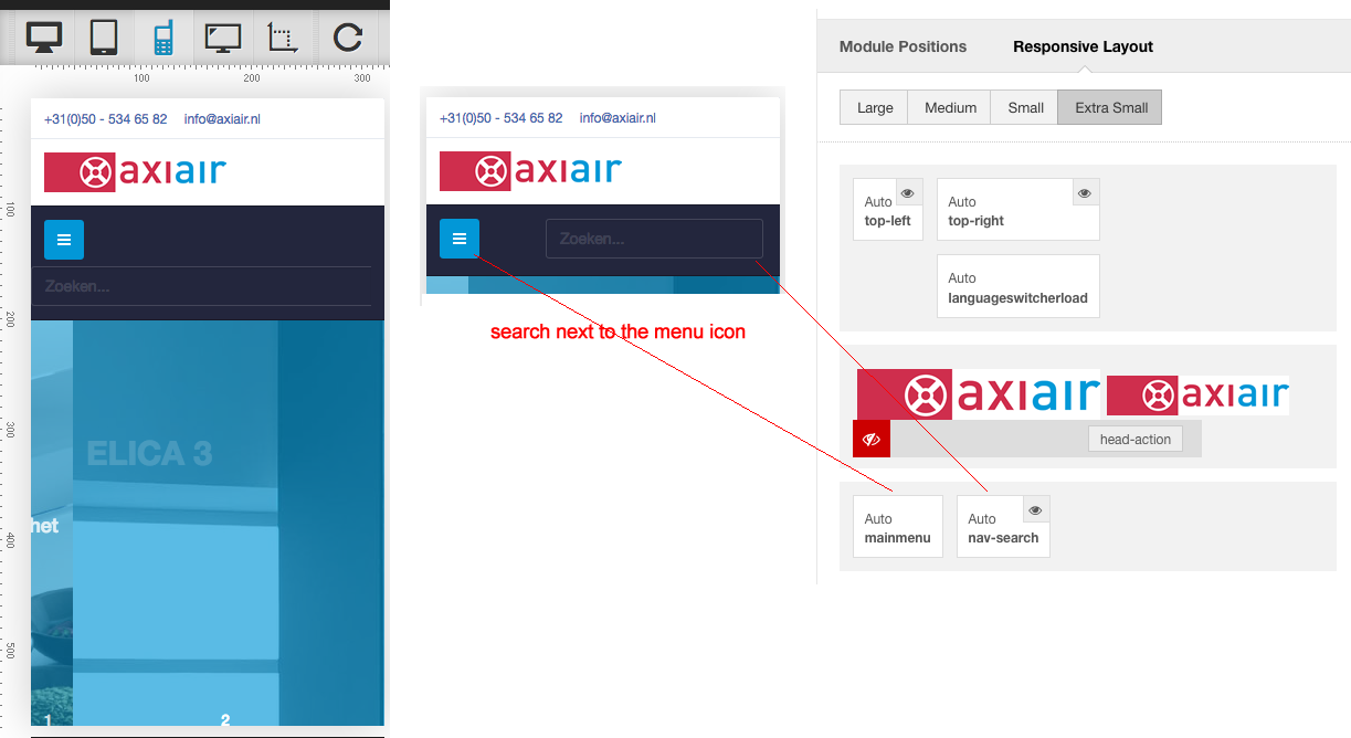
When the search box is used in the head-action position and when you make the website smaller the search-box becomes 100% on a smaller resolution. In the mobile view it goes over the logo.
Is there some way to style the box in the different resolutions? See my attached image.Thanks.
 Pankaj Sharma
Moderator
Pankaj Sharma
- Join date:
- February 2015
- Posts:
- 24589
- Downloads:
- 144
- Uploads:
- 202
- Thanks:
- 127
- Thanked:
- 4196 times in 4019 posts
January 13, 2017 at 8:42 am #1002049Hi
Kindly post the URL of page here.January 13, 2017 at 8:51 am #1002056 Pankaj Sharma
Moderator
Pankaj Sharma
- Join date:
- February 2015
- Posts:
- 24589
- Downloads:
- 144
- Uploads:
- 202
- Thanks:
- 127
- Thanked:
- 4196 times in 4019 posts
January 13, 2017 at 3:27 pm #1002121Hi
in the mobile, there is not enough space to show the search module in the same row with logo.
And in Ipad view, it is not full width: http://prntscr.com/dv6cdl
Kindly check it real device.January 13, 2017 at 6:30 pm #1002156Ah ok I understand. So i have now disabled the head-action for mobile view and i have enabled nav-search for mobile view. This way th search module shows next to the menu on mobile view.
I have only the issue that it jumps below the menu icon instead of next to it (aligned to the right)
See attached image
 Pankaj Sharma
Moderator
Pankaj Sharma
- Join date:
- February 2015
- Posts:
- 24589
- Downloads:
- 144
- Uploads:
- 202
- Thanks:
- 127
- Thanked:
- 4196 times in 4019 posts
January 16, 2017 at 2:08 am #1002450Hi
This is not the mega menu, its off-canvas sidebar that is showing on your site and both .
This is why both have full width in the mobile.AuthorPostsViewing 6 posts - 1 through 6 (of 6 total)This topic contains 5 replies, has 2 voices, and was last updated by
 Pankaj Sharma 7 years, 11 months ago.
We moved to new unified forum. Please post all new support queries in our New Forum
Jump to forum


