-
AuthorPosts
-
gigab082 Friend
gigab082
- Join date:
- March 2014
- Posts:
- 7
- Downloads:
- 0
- Uploads:
- 0
- Thanked:
- 3 times in 3 posts
March 29, 2014 at 11:10 am #196273Hello,
I’m creating a new website of my company (i’m French) with 2 languages French and English.
However, i have many problems with the position of the modules 🙁– Position head search with search module and multilanguage one .. i look at the documentation but didn’t understand the explanations 🙁
– As im new in Joomla, i don’t know how to put social icons (Facebook, Twitter …) Can you help me please ?
– The footer are not visible on mobile site but only in computer one .. i don’t understand why ..Sorry for these newbies questions lol 🙂 and many thanks in advance for your answers !!
1 user says Thank You to gigab082 for this useful post
wingly Friend
wingly
- Join date:
- February 2014
- Posts:
- 310
- Downloads:
- 0
- Uploads:
- 87
- Thanks:
- 80
- Thanked:
- 83 times in 48 posts
March 29, 2014 at 11:28 am #528565<em>@gigab082 418744 wrote:</em><blockquote>Hello,
I’m creating a new website of my company (i’m French) with 2 languages French and English.
However, i have many problems with the position of the modules 🙁– Position head search with search module and multilanguage one .. i look at the documentation but didn’t understand the explanations 🙁
– As im new in Joomla, i don’t know how to put social icons (Facebook, Twitter …) Can you help me please ?
– The footer are not visible on mobile site but only in computer one .. i don’t understand why ..Sorry for these newbies questions lol 🙂 and many thanks in advance for your answers !!</blockquote>
The current position of the search is pretty good positioned. You want to position it elsewhere? if not then you should not have problems.
There are many ways to implement social icons. It depends on where you want to put them. Like for each article or just for the page website itself? p.s. there are different social buttons, Facebook for example has like button like box e.t.c. Follow this link and you pick any of them and you will also be able to customize them. There are also extension that can help you out.
About the footer, JA Purity is not just a Joomla Template it’s using Joomla and T3 Framework. While managin the T3 Framework setting you can customize how pages will be displayed for desktop and other devices.
It would be better if you provide with a link to your website and print screen and provide links to the pages you encounter problems in with detailed explanation so that i could provide with direct and precise solution.
Do not get scared you will fast get along with it and understand how things work together.
gigab082 Friend
gigab082
- Join date:
- March 2014
- Posts:
- 7
- Downloads:
- 0
- Uploads:
- 0
- Thanked:
- 3 times in 3 posts
March 29, 2014 at 11:55 am #528567Hi, many thanks for your answer
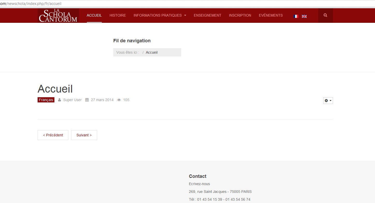
here is the page of the site http://schola-cantorum.com/newschola/index.php/fr/accueil
Note the problem with flags and search button 🙁And the problem with the logo in French part … the logo is originally more bigger and i can’t see it at all …
For social icons, i want them to be positioned in each page, i’ll search for an extension.I installed joomla because i don’t know anything in code, CSS and other … in Purity III that means that i have to know the html language ? :-[
1 user says Thank You to gigab082 for this useful post
wingly Friend
wingly
- Join date:
- February 2014
- Posts:
- 310
- Downloads:
- 0
- Uploads:
- 87
- Thanks:
- 80
- Thanked:
- 83 times in 48 posts
March 29, 2014 at 12:13 pm #528568<em>@gigab082 418750 wrote:</em><blockquote>Hi, many thanks for your answer
here is the page of the site http://schola-cantorum.com/newschola/index.php/fr/accueil
Note the problem with flags and search button 🙁
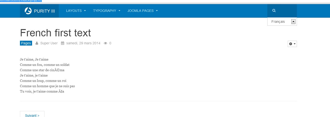
[</blockquote>Go to Module MAnager open teh Langauge switcher and change the position to head-search
It will be displayed like this – I find it as best solution for Purity III.
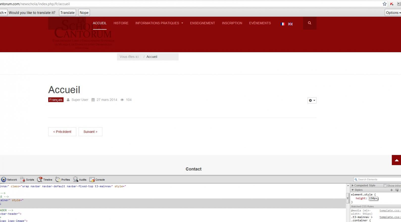
As for the logo it is really too Big, if you want to scale the menu to match the logo size it will look horrible. As Purity III is nto for this type of logo see this
You better change the logo so that it suits the Purity III design i suggest you do it like this
If you like the way it look here is the logo –
p.s. Now you do not need html or any other knowledge. But this knowledge help customize as you want and fast. But we are here to help you out with it 🙂 So have no fear


gigab082 Friend
gigab082
- Join date:
- March 2014
- Posts:
- 7
- Downloads:
- 0
- Uploads:
- 0
- Thanked:
- 3 times in 3 posts
March 29, 2014 at 12:18 pm #528569Thanks for your help 🙂
For the language switcher it is already in “head-search” position …
EDIT : There is an an explanation here http://www.joomlart.com/documentation/purity-iii/configuration#optimize-css
in the part ‘multilingual setup” but i don’t understand …lolFor the logo is there another way (another place) ? Masthead position for example ? i must put it lol and it must be readable 😉
1 user says Thank You to gigab082 for this useful post
wingly Friend
wingly
- Join date:
- February 2014
- Posts:
- 310
- Downloads:
- 0
- Uploads:
- 87
- Thanks:
- 80
- Thanked:
- 83 times in 48 posts
March 29, 2014 at 1:23 pm #528570<em>@gigab082 418752 wrote:</em><blockquote>Thanks for your help 🙂
For the language switcher it is already in “head-search” position …
</blockquote>
That is not a good idea to keep the logo of that size.. Ok so this is the first thing that came up to my mind:
Go to your the root where the files of your site are and navigate to templates/purity_iii/css/ – and open the files custom.css or create it if it does not exist and input there this code:
  @media only screen

and (min-width : 1224px) {
.mod-languages {
position: absolute;
left: 0px;
top: 90px;
}.logo-image {
margin-left: -150px;
}.logo-image a {
max-width: 290px;
max-height: 87px;
}.form-search {
min-height: 87px;
}.search {
min-height: 87px;
}.fa-search {
top: 37px;
}#mod-search-searchword {
height: 87px;
}.t3-navbar {
margin-top: 15px;
}a.dropdown-toggle {
min-height: 70px;
}}
And replace the current logo with this one form this link.
P.s. in the Language Switcher module you can choose to display it as Dropdown and it will be displayed like in the link i send you in previous post.
P.s. go to Module Manager and open the Breadcrumbs and change it’s position to breadcrumbs! Cause you put it in the wrong position and it displays not good.
gigab082 Friend
gigab082
- Join date:
- March 2014
- Posts:
- 7
- Downloads:
- 0
- Uploads:
- 0
- Thanked:
- 3 times in 3 posts
March 29, 2014 at 2:29 pm #528579Many thanks !!
But for the logo, i think we can put it less bigger (excuse my english i’m french lol) .. and for the position, i think it is too much in the left …
For the language, i put the language menu to breadcrums and it has disapeared 🙁
Is it possible to make as the Configuration CSS of Purity ?<blockquote>Custom style
By default, when you publish the module in the “head-search”, it does not look as nice as you might like, so you might need to custom its style a bit.
language switcher module
To custom style, add style to any .less file in your template LESS folder (templates/purity_iii/less).Add the following style to the file: templates/purity_iii/less/style.less
// language switcher module
// ———
.mod-languages {
position: absolute;
left: -100px;
top: 20px;
// more style comes here
}custom style</blockquote>
But i don’t really understand 🙁
wingly Friend
wingly
- Join date:
- February 2014
- Posts:
- 310
- Downloads:
- 0
- Uploads:
- 87
- Thanks:
- 80
- Thanked:
- 83 times in 48 posts
March 29, 2014 at 2:36 pm #528581<em>@gigab082 418766 wrote:</em><blockquote>Many thanks !!
But for the logo, i think we can put it less bigger (excuse my english i’m french lol) .. and for the position, i think it is too much in the left …
For the language, i put the language menu to breadcrums and it has disapeared 🙁
Is it possible to make as the Configuration CSS of Purity ?But i don’t really understand :(</blockquote>
Put the language Module back as it was. Find the “Breadcrumbs” module and assign it to position ‘breadcrumbs’
If this position will not be good then choose position “navhelper”
p.s. Go again to custom.css and change the following code:
.logo-image {

margin-left: -150px;

}
to this one:
.logo-image {

margin-left: -50px;

}
p.s. i have to go now. See you on Monday if you will still have questions. But feel free to post any of them. I’ll get back to you and respond to all of them. Have a nice weekend!
gigab082 Friend
gigab082
- Join date:
- March 2014
- Posts:
- 7
- Downloads:
- 0
- Uploads:
- 0
- Thanked:
- 3 times in 3 posts
March 31, 2014 at 10:39 am #528765Hello 🙂
Finally, i deleted the template and then reinstalled it completely ..
Maybe it is better to put the logo in Masthead position ? but i don’t know how to do this 🙁For the language and search button, i think i will not put the search field, and just let the language switcher … but how i can do to center vertically the flags ?
Other question, is it possible to delete in the footer <blockquote>Bootstrap is a front-end framework of Twitter, Inc. Code licensed under MIT License.
Font Awesome font licensed under SIL OFL 1.1.</blockquote> ?i think i’ll have other questions, but right now, that’s all 🙂
Many thanks again for your help 🙂wingly Friend
wingly
- Join date:
- February 2014
- Posts:
- 310
- Downloads:
- 0
- Uploads:
- 87
- Thanks:
- 80
- Thanked:
- 83 times in 48 posts
March 31, 2014 at 11:11 am #528769If you put is in masthead then it will take only entire row only for the logo! and all of your content will go down. And it will take much css especially for tablets and mobile to somehow position it correctly. I do not think it’s a good option.
As per GPL license, you are not allowed to remove the license from the code files – Sorry 🙂gigab082 Friend
gigab082
- Join date:
- March 2014
- Posts:
- 7
- Downloads:
- 0
- Uploads:
- 0
- Thanked:
- 3 times in 3 posts
March 31, 2014 at 11:28 am #528772mmm …. yes you’re probably right .. even if i put something else near the logo ?
Look at the current website http://www.schola-cantorum.com, i which i can put the logo like that .. in fact that we did last week was quite good but the header was too large i think ..Any idea ?
And for the footer, is it possible to have separator between the “follow us” and “contact” ?
(for social icons, i’ve downloaded icons on internet but i search for a component which do the same natively with some effects in the icons when mouse is on, have you an idea ?)🙂
wingly Friend
wingly
- Join date:
- February 2014
- Posts:
- 310
- Downloads:
- 0
- Uploads:
- 87
- Thanks:
- 80
- Thanked:
- 83 times in 48 posts
March 31, 2014 at 11:43 am #528778If you take a closer look at the current website, the header here is even bigger. In order not to make it wider they put the search bar with social icons on top, So the current one is much bigger then we did it in your new one. Out of the solutions we tried before i have no other good option for you.
S to center the language flags go to your custom.css(you already know where it is ) and add the following code
.mod-languages {

margin-top: 16px;

}
gigab082 Friend
gigab082
- Join date:
- March 2014
- Posts:
- 7
- Downloads:
- 0
- Uploads:
- 0
- Thanked:
- 3 times in 3 posts
March 31, 2014 at 12:23 pm #528785ok, i’ll see .. i’m customizing the template, but if there is an update, my changes will be saved or i must make all the changes another time ?
wingly Friend
wingly
- Join date:
- February 2014
- Posts:
- 310
- Downloads:
- 0
- Uploads:
- 87
- Thanks:
- 80
- Thanked:
- 83 times in 48 posts
AuthorPostsViewing 14 posts - 1 through 14 (of 14 total)This topic contains 14 replies, has 2 voices, and was last updated by
wingly 10 years, 9 months ago.
We moved to new unified forum. Please post all new support queries in our New Forum
Jump to forum
Some problems with modules position
Viewing 14 posts - 1 through 14 (of 14 total)


