Viewing 4 posts - 1 through 4 (of 4 total)
  • Author
    Posts
  • maxiyemal Friend
    #189957

    Hello
    I’m using ja-elastica.
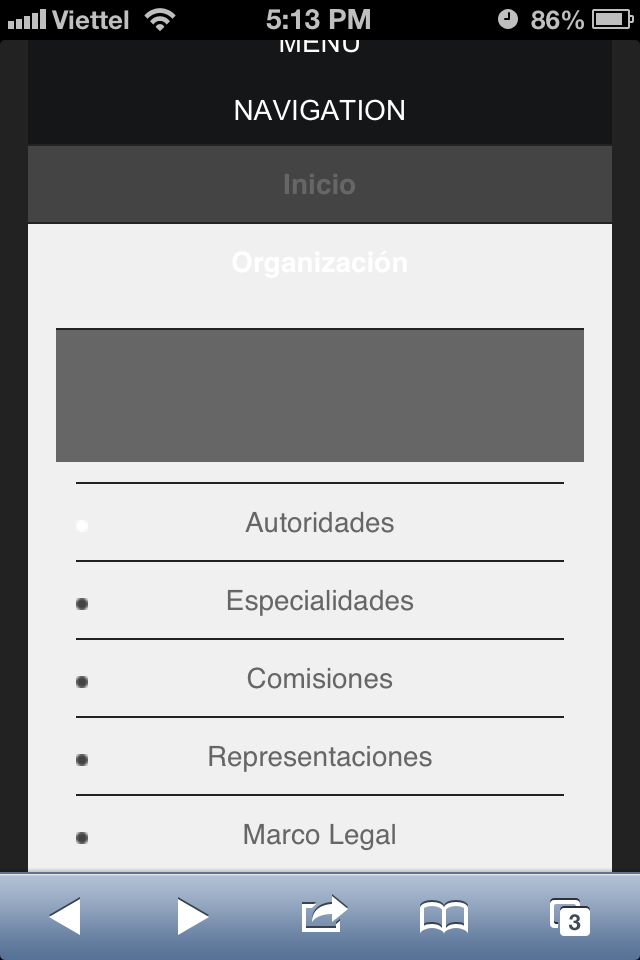
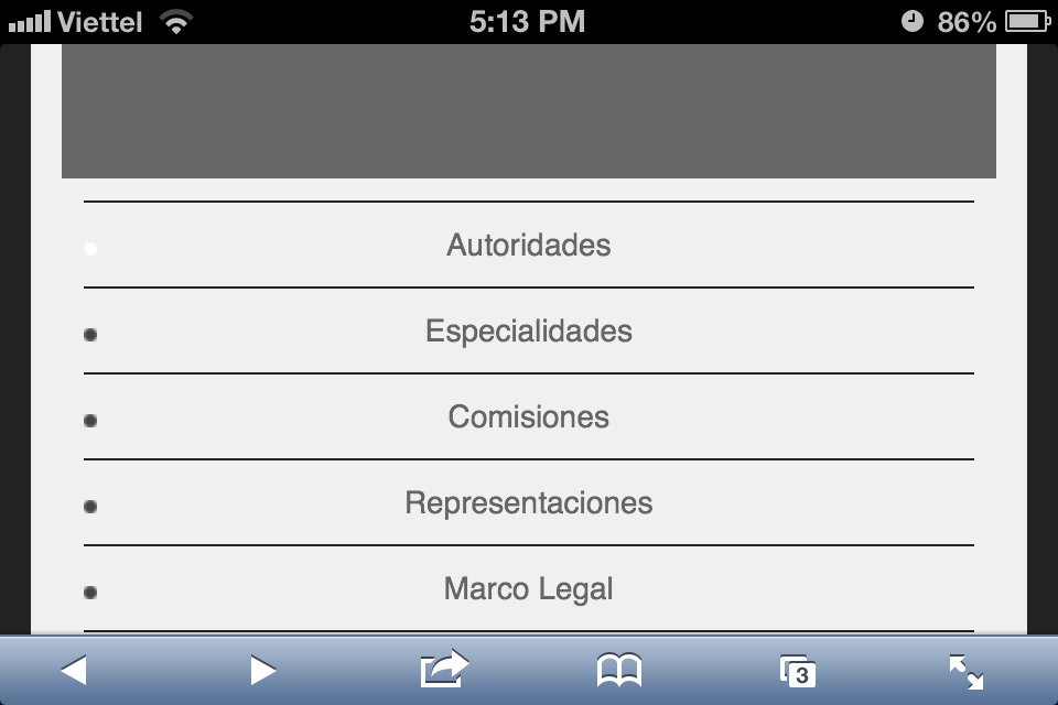
    I have a big menu, but, when I change to moblie layout submenus are not opening then it is impossible to navigate.
    How can I fix this?
    Can I have a different menu to mobile layouts?
    The url is http://www.colpsi14.org.ar/jupgrade/
    Thank you

    phong nam Friend
    #503264

    Hi maxiyemal,

    By default, you will need to click the parent menus in order to select the sub menu items you want to see. Anyways, I still saw the submenu items displaying fine on your website. Do you still need our help on this concern ?


    enosb Friend
    #505359

    Also in my site in mobile device (smartphone android 4.1.2) i can’t access to submenu!
    http://www.vendramin.org/jupgrade/

    phong nam Friend
    #505438

    Hi enosb,

    By default, with JA Elastica template the sub-menu items will be hidden on the mobile view, that is why you couldn’t see them on your mobile. You can see our JA Elastica demo at http://joomla25-templates.joomlart.com/ja_elastica/

    Anyways, you can show the sub-menu items on mobile by backing up your files and following below tip:

    Open templates/ja_elastica/css/layout-mobile.css, and replace lines:

    #ja-megamenu .childcontent {
    display: none !important;
    }

    with

    #ja-megamenu .childcontent {
    display: block !important;
    position: relative;
    }

    div.childcontent.cols1 {
    width: 200px !important;
    height: auto !important;
    }

    Adjust the css elements if you want and clear JAT3 cache.

Viewing 4 posts - 1 through 4 (of 4 total)

This topic contains 4 replies, has 3 voices, and was last updated by  phong nam 11 years, 2 months ago.

We moved to new unified forum. Please post all new support queries in our New Forum