-
AuthorPosts
-
synapsis Friend
synapsis
- Join date:
- April 2007
- Posts:
- 234
- Downloads:
- 18
- Uploads:
- 28
- Thanks:
- 58
- Thanked:
- 19 times in 1 posts
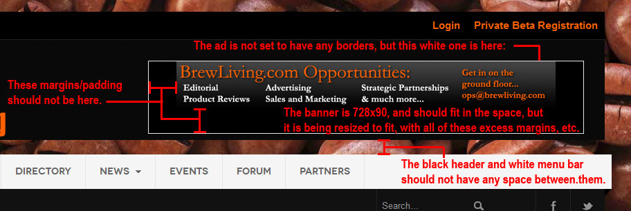
April 11, 2014 at 9:32 pm #196688I’m trying to place an iJoomla Ad Agency zone module into the header of JA Mitius. I’ve got the new module position created (position-21), but when I turn on the zone module to actually place the ad, there appear to be a lot of CSS conflicts that are making it display poorly.
I’ve corrected most of them myself with a lot of frustration, but the banner still has odd margins that are creating a gap between the header and the main menu. It is also displaying at a reduced size (only 550px wide instead of 728×90). Could this be because there’s not enough room in the span? If so, what must I do to make it fit at full 728×90 size on desktops?
.module-ct appears to be one of the bigger offenders, but altering it negatively affects other modules using that class.
Here’s a screen capture of what I mean:
I’ve tried using a module class suffix to fix this at the modular level, but I’ve had only moderate success correcting some of the issues marked on the screen capture.
Would someone please take a look and see if they can spot what I’m missing?
Thanks so very much.
 TomC
Moderator
TomC
- Join date:
- October 2014
- Posts:
- 14077
- Downloads:
- 58
- Uploads:
- 137
- Thanks:
- 948
- Thanked:
- 3155 times in 2495 posts
April 11, 2014 at 10:31 pm #530633First of all – to get rid of that gap between main nav and the header section, try adding this to your custom.css
.module-ct {

    background: inherit;

    color: inherit;

    padding: 0 20px;

}
Doesn’t look like that negatively affects much else . . . . though if you find any other elements within your site that are screwy because of it, you can always delete it.
Also, why do you have a full surround margin property of 30px in the following CSS?
.leaderboard {

    background-color: #000000

    margin: 30px;

    padding: 0;

}
What if you were to just use a “margin-top” property – for example:
.leaderboard {

    background-color: #000000

    margin-top: 30px;

    padding: 0;

}
1 user says Thank You to TomC for this useful post
synapsis Friend
synapsis
- Join date:
- April 2007
- Posts:
- 234
- Downloads:
- 18
- Uploads:
- 28
- Thanks:
- 58
- Thanked:
- 19 times in 1 posts
April 12, 2014 at 9:31 pm #530692Tom,
Thanks for catching that redundant .leaderboard class. I must have been blind to miss it. I had changed it elsewhere on the custom.css, but since it was lower on the page, it was getting overridden.With your help, I’ve managed to get all of the blatant margins removed, so the page at least “looks” better. But the ad is still not displaying at its full size (728×90). There IS a black box around the banner that looks to be the full banner size, but for the life of me, I can’t see what’s causing the banner to display smaller than the space allotted.
It *is* displaying responsively as it should at least, so that’s good — but what’s causing the resizing? Could it be that the span allotted is not wide enough, even though the background is visibly showing large enough for the full ad size? (It’s hard to see on some monitors, but it’s definitely there.)
Your continued help with this is *much* appreciated. I have to get this advertising system in place before the site can launch, and I don’t want to hold it up much longer. So anything further you can do is much appreciated. Even if it means making the logo a little smaller (span3 instead of span4?), so I can change the span8 that the banner is in to a span9? I can’t see how to do that in the template manager, so any assistance you can offer there is also appreciated.
Thanks so much.
Matt Ninja Lead
Moderator
Ninja Lead
- Join date:
- November 2014
- Posts:
- 16064
- Downloads:
- 310
- Uploads:
- 2864
- Thanks:
- 341
- Thanked:
- 3854 times in 3563 posts
April 14, 2014 at 8:44 am #530773Hi Matt,
Please follow steps below, it should help to fix the problem.
+ Open the templates/ja_mitius/css/custom.css file
Change
th.leaderboard_ad,

td.leaderboard)ad {

  line-height: 20px;

  padding: 0px 0px 0px 0px;

  text-align: left;

  vertical-align: top;

}
To
th.leaderboard_ad,
td.leaderboard_ad {
line-height: 20px;
padding: 0px 0px 0px 0px;
text-align: left;
vertical-align: top;
}
.mod_ijoomlazone td, .mod_ijoomlazone tr {
padding: 0px !important;
}
+ Open the templates/ja_mitius/tpls/blocks/header.php file
Change
<div class="span4">

...

</div>
<div class="span8">
...
</div>To
<div class="span3">

...

</div>
<div class="span9">
...
</div>1 user says Thank You to Ninja Lead for this useful post
synapsis Friend
synapsis
- Join date:
- April 2007
- Posts:
- 234
- Downloads:
- 18
- Uploads:
- 28
- Thanks:
- 58
- Thanked:
- 19 times in 1 posts
April 15, 2014 at 2:03 am #530887That appears to have solved it — at least as well as is possible. There’s still some padding around the image that I can’t locate, but when I apply the right background to it, it is no longer visible.
I hate to compromise like that, but there’s still so much to do and so little time to do it in.
Thanks again for your help, guys. Much appreciated.
AuthorPostsViewing 5 posts - 1 through 5 (of 5 total)This topic contains 5 replies, has 3 voices, and was last updated by
synapsis 10 years, 7 months ago.
We moved to new unified forum. Please post all new support queries in our New Forum
Template conflict with iJoomla Ad Agency zone module
Viewing 5 posts - 1 through 5 (of 5 total)


