-
AuthorPosts
-
January 19, 2016 at 8:56 pm #858307
Somehow the T3 footer block remains and is using a lot of whitespace.
How do I hide/remove that big white block?and
How do I get the Get Started block to show without white spaces on the side?
and
Why does the Get started module not display on mobile devices, even though the position view is activated?
Overall I must say that I have really struggled with the template so far and it is not very intuitive/user friendly.
Also found that the menu does not display on mobile devices unless I activate the slider menu.
Is there also a way to change the headername of the slidemenu? to just Menu? Pankaj Sharma
Moderator
Pankaj Sharma
- Join date:
- February 2015
- Posts:
- 24589
- Downloads:
- 144
- Uploads:
- 202
- Thanks:
- 127
- Thanked:
- 4196 times in 4019 posts
January 20, 2016 at 4:24 am #862101Hi
For the space in footer i already replied you here .
These are container used for the module position to show details in Footer (modules) .Why does the Get started module not display on mobile devices, even though the position view is activated?
Could u provide me screenshot which space u want to eliminate from the site . So i can suggest you changes for it .
To enable the Mega menu in mobile view Go to template options > Navigation > Enable Mega menu
and Enable collapse navigation for small screens .
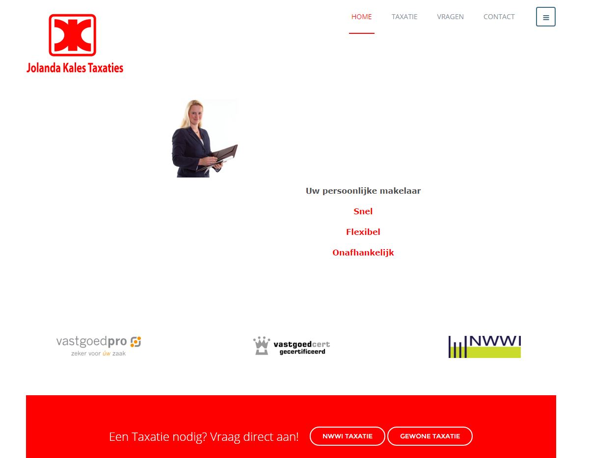
Here : http://prntscr.com/9sdjfzJanuary 21, 2016 at 8:27 pm #864791Hi, Please find the screenshot attached from the pc large view.
On there at the bottom you will see the boig red box with the text:
Een taxatie nodig? Vraag direct aan!This is my modified version of the Getting Started custom HTML module.
In custom.css I have changed the background color
@media (min-width: 1280px) {
.get-started {
text-align: center;
background: #ff0000
}
.get-started p {
color: #ffffff;
display: inline-block;
font-size: 24px;
font-weight: 100;
margin-bottom: 14px;
vertical-align: middle;
}
@media (min-width: 768px) {
.get-started p {
background: #7a8f99
margin-right: 48px;
margin-right: 18px;
margin-bottom: 66px;
margin-top: 66px;
}
}
.get-started .btn-white:hover,
.get-started .btn-white:active,
.get-started .btn-white:focus {
color: #ff0000;
}}This seems to work on the pc layout, but does not show on my ipad and mobile phone where I think the components is there, but still with a white background and white text as a result of which you can not see it….and appears to be just white space.
Any idea how we can get the display to also work on mobile devices?
Regards,
MartinJanuary 21, 2016 at 8:28 pm #864796 Pankaj Sharma
Moderator
Pankaj Sharma
- Join date:
- February 2015
- Posts:
- 24589
- Downloads:
- 144
- Uploads:
- 202
- Thanks:
- 127
- Thanked:
- 4196 times in 4019 posts
January 22, 2016 at 2:20 am #865005Hi
There is syntax error in the code u posted .
U need to close the bracket when use media class .
Here > http://prntscr.com/9t78ep
Apply it and code will work : http://prntscr.com/9t78nhAuthorPostsViewing 5 posts - 1 through 5 (of 5 total)This topic contains 4 replies, has 2 voices, and was last updated by
 Pankaj Sharma 8 years, 10 months ago.
We moved to new unified forum. Please post all new support queries in our New Forum
Template does not behave as expected.
Viewing 5 posts - 1 through 5 (of 5 total)


