Tagged: JA Biz responosive scaling
-
AuthorPosts
-
propolis Friend
propolis
- Join date:
- March 2014
- Posts:
- 122
- Downloads:
- 189
- Uploads:
- 57
- Thanks:
- 47
- Thanked:
- 4 times in 4 posts
January 15, 2016 at 7:16 am #848435Hello,
I am using JA Biz template (latest version) I use Joomla 3.4.8 Site Link: Site
When I test my site on different devices or web emulators I find that it does not scale correctly for iPad mini.
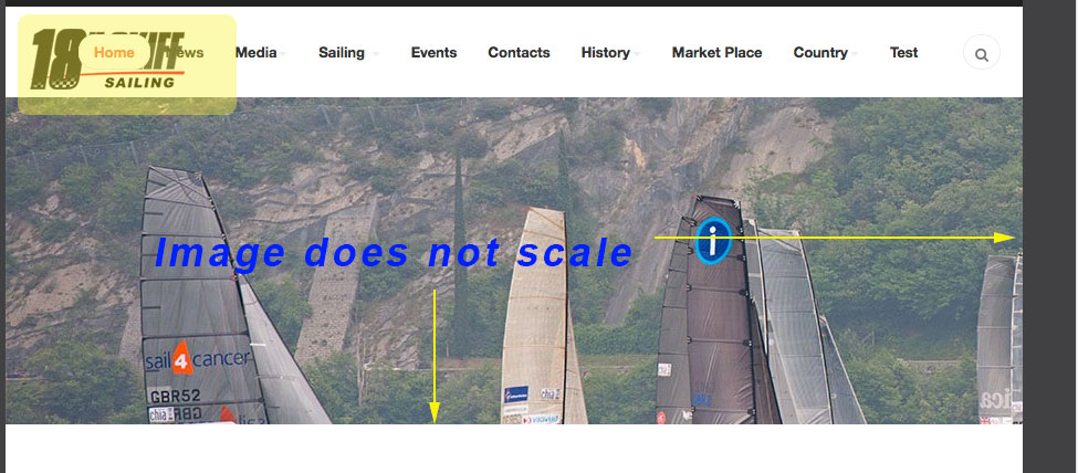
From the image you wil see that there is a problem with the menu and also the ja Slideshow images does not scale

On another note, if I just resize my site in any browser, it also does not scale correctly. If its a smart phone, iPad, Laptop, iMac etc its fine, but not if the browser is in between those preset sizes
Any suggestions much appreciated
Eddie
propolis Friend
propolis
- Join date:
- March 2014
- Posts:
- 122
- Downloads:
- 189
- Uploads:
- 57
- Thanks:
- 47
- Thanked:
- 4 times in 4 posts
January 18, 2016 at 7:05 am #851342Any update for me on this matter?
Thanks 🙂
Adam M Moderator
Adam M
- Join date:
- May 2014
- Posts:
- 5159
- Downloads:
- 33
- Uploads:
- 66
- Thanks:
- 95
- Thanked:
- 1271 times in 1235 posts
January 19, 2016 at 3:20 am #852243Hi @propolis,
-
Please open file templates/ja_biz/css/custom.css then add this line :
img {
 max-width: 100%;
}
it will fix the problem with image in slideshow.
- For other parts, it’s because you’re trying to resize your browser to the resolution which doesn’t belong to any device, please check with BrowserStack instead.
propolis Friend
propolis
- Join date:
- March 2014
- Posts:
- 122
- Downloads:
- 189
- Uploads:
- 57
- Thanks:
- 47
- Thanked:
- 4 times in 4 posts
January 19, 2016 at 6:58 am #852455Thank you for the reply.
Is it not a template issue that it does not work for an iPad mini size?
The browser scaling I can understand, but not for a specific device size
Thanks
Eddie
Adam M Moderator
Adam M
- Join date:
- May 2014
- Posts:
- 5159
- Downloads:
- 33
- Uploads:
- 66
- Thanks:
- 95
- Thanked:
- 1271 times in 1235 posts
January 19, 2016 at 7:46 am #852560Hi @propolis,
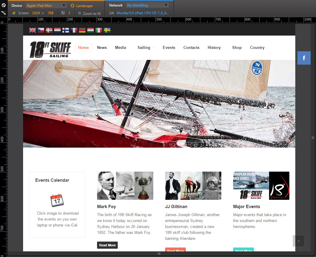
Yes indeed it’s not a template issue because the iPad mini site resolution is around 1024×768 (pixels). Here are 2 attachment screenshots that I captured your site running in Chrome Emulator. If you still see the problem in your iPad mini, please capture a screenshot which I can see your browser as well (the first one you provided has been cut off so I didn’t know which browser are you running), as provide the iOS version you’re running so I can check it with real device at my end.
-
propolis Friend
propolis
- Join date:
- March 2014
- Posts:
- 122
- Downloads:
- 189
- Uploads:
- 57
- Thanks:
- 47
- Thanked:
- 4 times in 4 posts
January 19, 2016 at 8:31 am #852684Thanks Adam,
When I get home I will send you the details of the iPad mini.
Thanks for all the help so far
Eddie
Adam M Moderator
Adam M
- Join date:
- May 2014
- Posts:
- 5159
- Downloads:
- 33
- Uploads:
- 66
- Thanks:
- 95
- Thanked:
- 1271 times in 1235 posts
-
AuthorPosts
Viewing 8 posts - 1 through 8 (of 8 total)This topic contains 7 replies, has 2 voices, and was last updated by
propolis 8 years, 10 months ago.
We moved to new unified forum. Please post all new support queries in our New Forum
Jump to forum


