-
AuthorPosts
-
March 7, 2016 at 2:03 pm #896087
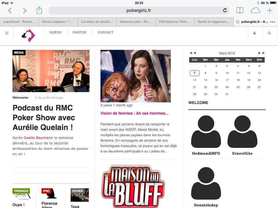
Hello, I have a problem on mobile responsive (photo attached). Top1 The menu appears at the top of the module 10. what’s going on?
Is it possible to align the logo on the same line as the sharing icons, login and search?
Thanks in advance.
 Pankaj Sharma
Moderator
Pankaj Sharma
- Join date:
- February 2015
- Posts:
- 24589
- Downloads:
- 144
- Uploads:
- 202
- Thanks:
- 127
- Thanked:
- 4196 times in 4019 posts
March 7, 2016 at 2:44 pm #896095Hi
Add below code in custom.css file to fix the padding issue@media (max-width: 767px) { .t3-sl { padding-top: 50px; } }In mobile there is not enough space so they (menu/logo/social/search/login) are not showing in one line .
March 7, 2016 at 3:43 pm #896111Where is custom.css ? In /www/templates/ja_magz/css ? If yes, i have nothing.
I created this file with the code but nothing has changed.
thx
 Pankaj Sharma
Moderator
Pankaj Sharma
- Join date:
- February 2015
- Posts:
- 24589
- Downloads:
- 144
- Uploads:
- 202
- Thanks:
- 127
- Thanked:
- 4196 times in 4019 posts
March 8, 2016 at 12:26 am #896312Hi
use this code in custom.css@media (max-width: 767px) { .t3-sl { padding-top: 50px!important; } }if file is not in /css folder create it .
March 8, 2016 at 12:50 am #896326 Pankaj Sharma
Moderator
Pankaj Sharma
- Join date:
- February 2015
- Posts:
- 24589
- Downloads:
- 144
- Uploads:
- 202
- Thanks:
- 127
- Thanked:
- 4196 times in 4019 posts
March 8, 2016 at 1:07 am #896329Hi
I fixed the issue directly on your site .
For the module position issue > In the small layout you can not use module position in same row as they can not be fit . I changed the site to span12 from template options > Layout > responsive layout > small .
Here : http://prntscr.com/acj3afMarch 8, 2016 at 1:27 am #896334Thanks a lot ! But on my mobile (android), they are always a supporsition between top1 and home10. (please see attachment)
it’s ok for Tablet, whats happen ?
thx
-
 Pankaj Sharma
Moderator
Pankaj Sharma
- Join date:
- February 2015
- Posts:
- 24589
- Downloads:
- 144
- Uploads:
- 202
- Thanks:
- 127
- Thanked:
- 4196 times in 4019 posts
March 8, 2016 at 1:36 am #896338Hi
In mobile there is not enough space so u can not show them like large display .
You can change the module position size from Template options > Layout > responsive layout > small .
Here : http://prntscr.com/acj3af -
AuthorPosts
Viewing 8 posts - 1 through 8 (of 8 total)This topic contains 7 replies, has 2 voices, and was last updated by
 Pankaj Sharma 8 years, 8 months ago.
We moved to new unified forum. Please post all new support queries in our New Forum
Jump to forum


