-
AuthorPosts
-
November 3, 2016 at 1:18 pm #983163
Hi
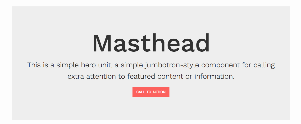
I’doing – still – an homepage based on JA Resume. In the documentation page for JA Resume it states, that you should be able to insert a grey block with some text and a button called Masthead.I would like to use a similar feature – but I want it be placed inside an article. I attach a screendump of the grey block for your identification. And a link to a page where it should be placed with the existing text inside.
Thanks for any hints as to controll these matters.November 3, 2016 at 1:22 pm #983167Just another thing, though:
As U can see I’m using your gallery on the page. But here the background suddenly is black! In the frontpage you’ll notice the background is white (or transparent)
How do I control these thingsYours
 Ninja Lead
Moderator
Ninja Lead
- Join date:
- November 2014
- Posts:
- 16064
- Downloads:
- 310
- Uploads:
- 2864
- Thanks:
- 341
- Thanked:
- 3854 times in 3563 posts
November 4, 2016 at 3:24 am #983283Hi,
Please have a look at the background image on your site: http://caetano.info/new2/images/carlafront-new2.png and that image is showing cover full gallery section on your site, you need to change that image to transparent and not black
About the problem in Home page of your site. you can give me the screenshot and description on that, it would help to understand the problem on your site
Regards
November 4, 2016 at 10:59 am #983420Sorry, I think you misunderstood my question regarding the background color.
I f you take a look at this page: http://caetano.info/new2/da/works/tidligere-v%C3%A6rker/dharti-jordens-moder you’ll see that the gallery has black as background color.
In the front page the same gallery appears transparant.November 4, 2016 at 11:03 am #983421And the other question:
I’m creating a lot of pages with an article containg a little text and a gallery module assigned to it.
I would like to put the text into a box like the ones you have demonstrated in your demosite. Look at the attached image.I would like the box with a bit of text in it to appear above the gallery – eg http://caetano.info/new2/da/works/tidligere-v%C3%A6rker/dharti-jordens-moder.
regards
 Ninja Lead
Moderator
Ninja Lead
- Join date:
- November 2014
- Posts:
- 16064
- Downloads:
- 310
- Uploads:
- 2864
- Thanks:
- 341
- Thanked:
- 3854 times in 3563 posts
November 7, 2016 at 8:52 am #984033Hi,
You can change the background of gallery module from templates/ja_resume/css/template.css file
.t3-mast-bottom.t3-features-intro .section-content {
  background-color: #222222;
}
About the masthead module, I could not see that module by default on JA Resume template
Regards
November 7, 2016 at 2:49 pm #984150hi again
If you look here http://www.joomlart.com/demo/#ja_resume you’ll see different kinds of typo’s and blocks…
I’ve used the the one called jumbotron masthead….Its placed in top of the article as you can see here:http://caetano.info/new2/da/works/tidligere-v%C3%A6rker/indre-rejser
Beneath it we have a gallery which for present is positioned in Mast-bottom!My problem is the huge gap of space between the bottom of the block and top of the gallery. Probably caused by the position in Mast-bottom. I would like it only to have aprox 20 px of space between the two!
Is that posible? Ninja Lead
Moderator
Ninja Lead
- Join date:
- November 2014
- Posts:
- 16064
- Downloads:
- 310
- Uploads:
- 2864
- Thanks:
- 341
- Thanked:
- 3854 times in 3563 posts
November 8, 2016 at 4:09 am #984335Hi,
You can have a look the configuration from our docs and our demo is using default layout
I checked the URL of your site but I got this bug http://prntscr.com/d4h0nt, you can give me the URL to see this bug, a screenshot with the description on that. It would help to understand the problem on your site. I will help you out
Regards
AuthorPostsViewing 8 posts - 1 through 8 (of 8 total)This topic contains 7 replies, has 2 voices, and was last updated by
 Ninja Lead 8 years, 2 months ago.
We moved to new unified forum. Please post all new support queries in our New Forum
using blocks and awesome fonts
Viewing 8 posts - 1 through 8 (of 8 total)


