-
AuthorPosts
-
 TomC
Moderator
TomC
- Join date:
- October 2014
- Posts:
- 14077
- Downloads:
- 58
- Uploads:
- 137
- Thanks:
- 948
- Thanked:
- 3155 times in 2495 posts
July 1, 2013 at 6:34 pm #497557Okay, for THAT site, here’s what you can try . . .
Within file path –> cps/templates/ja_zite/css/k2.css
at line 3702, you should see the following:
div.content-home ul li {

    background: none repeat scroll 0 0 transparent;

    border: 0 none;

    float: left;

    margin: 0 0 15px;

    padding: 0;

    width: 33.3%;

}
Modify the “width” property to a lower value – for example:
div.content-home ul li {

    background: none repeat scroll 0 0 transparent;

    border: 0 none;

    float: left;

    margin: 0 0 15px;

    padding: 0;

    width: 20%;

}
You will then, of course, need to modify the dimensions of the images that accompany each block – which I believe you can do within your K2 settings for those elements.
You may also need to create some temporary “dummy images” at the new/correct height and width dimentions … which is pretty easy to do within your image manager program (i.e. Photoshop or any other). What I would do is simply resize the existing “dummy/placeholder” images and rename/save it to the same image file folder as the others within your site structure.
Hope That Helps
1 user says Thank You to TomC for this useful post
July 1, 2013 at 6:43 pm #497559I will test it asap when i have the chance…
Thank you very much for your fast replyKind regards
July 1, 2013 at 8:27 pm #497578Hey Tom,
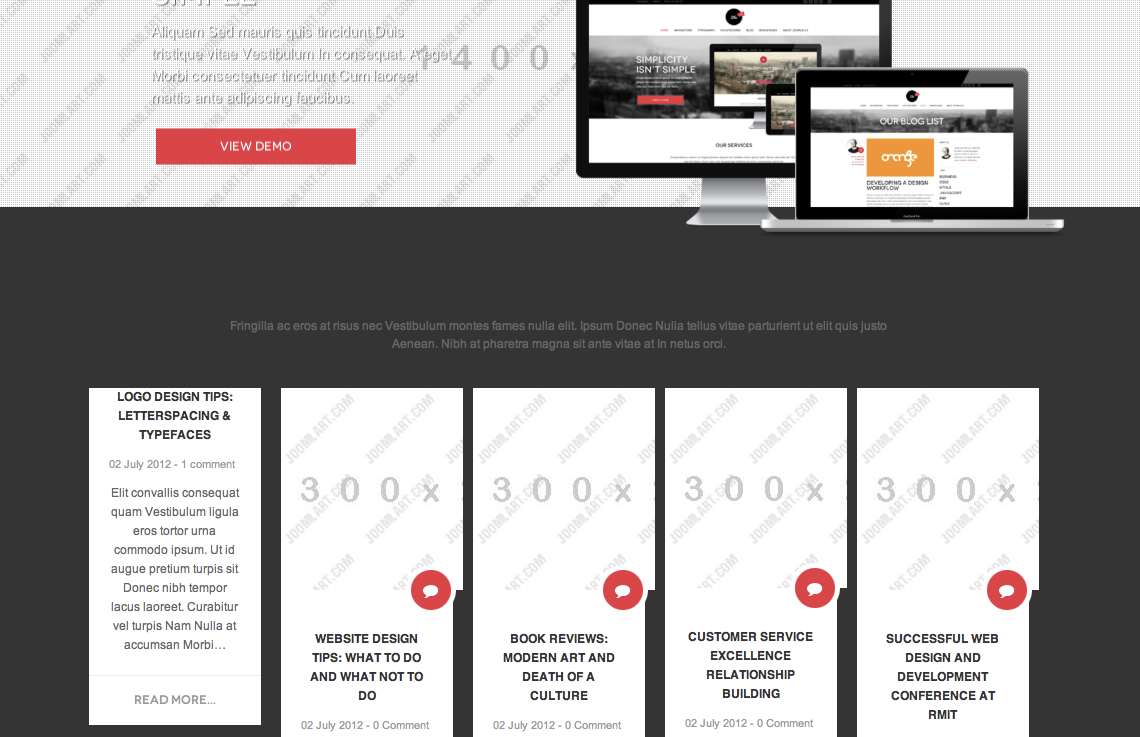
I change everything in the css but if have a little problem .
The icon isn’t centered.(see image)If i scale the image would the problem solved , or do i need to change something els in the css??
kind regards
 TomC
Moderator
TomC
- Join date:
- October 2014
- Posts:
- 14077
- Downloads:
- 58
- Uploads:
- 137
- Thanks:
- 948
- Thanked:
- 3155 times in 2495 posts
July 1, 2013 at 8:30 pm #497579File path –> /cps/templates/ja_zite/css/k2.css
at line 3722, modify the “left” parameter as follows:
div.content-home div.moduleItemImage span {

    background: url("../images/badge-bg.png") no-repeat scroll 0 0 transparent;

    bottom: -25px;

    display: block;

    height: 50px;

    left: 60px;

    position: absolute;

    width: 50px;

}
Better ?? 😎
1 user says Thank You to TomC for this useful post
July 1, 2013 at 8:59 pm #497583it workt!!
your my hero thnx ! 🙂
 TomC
Moderator
TomC
- Join date:
- October 2014
- Posts:
- 14077
- Downloads:
- 58
- Uploads:
- 137
- Thanks:
- 948
- Thanked:
- 3155 times in 2495 posts
July 1, 2013 at 9:01 pm #497584Glad to be able to assist !!!! … All the best with your continuing site development. 🙂
1 user says Thank You to TomC for this useful post
July 2, 2013 at 9:35 am #497666Hi Tom,
thnx for your help but im sorry i need to bother you again.
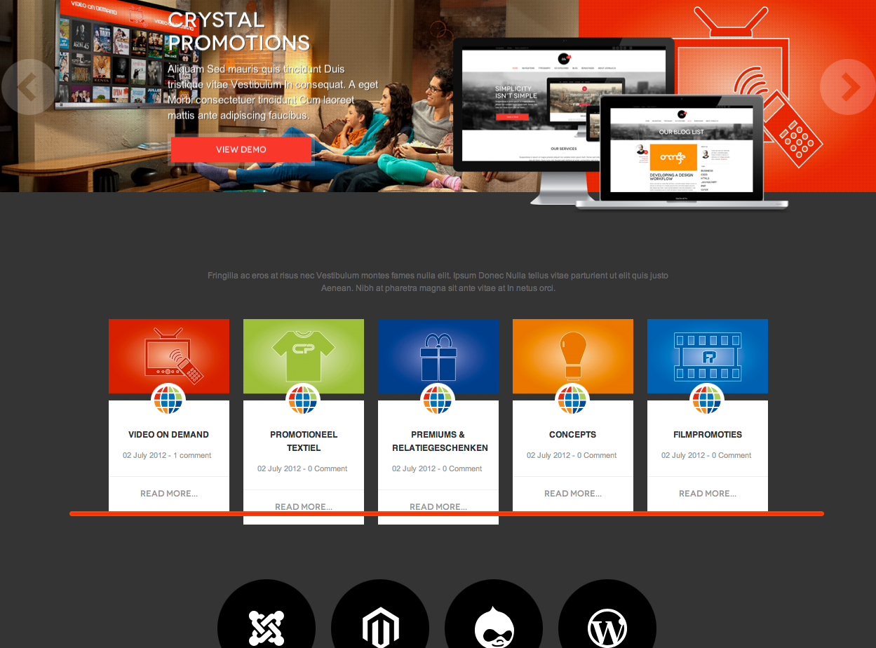
Is it possible to make the hight of the ” our blogs ” boxes all the same even if the widht of the text arent same??(see attachment what i want to achieve).
I think i need to make the other 3 bigger so the “read more” get on 1 line. but how?
And also where can i change the text ” read more” i want to change it in dutch
kind regards
 TomC
Moderator
TomC
- Join date:
- October 2014
- Posts:
- 14077
- Downloads:
- 58
- Uploads:
- 137
- Thanks:
- 948
- Thanked:
- 3155 times in 2495 posts
July 2, 2013 at 4:02 pm #497707Within file path –> /cps/templates/ja_zite/css/k2.css
at line 3737, delete the “padding” property from the CSS rule – as such:
div.content-home ul li a.moduleItemTitle {

    color: #333333

    display: block;

    font-family: sans-serif;

    font-size: 100%;

    font-weight: bold;

    margin-bottom: 10px;

    text-align: center;

    text-decoration: none;

    text-transform: uppercase;
}
Now, the only issue remaining appears to be the center block item – which I think is due to the length of the item title.
Any chance of shortening it a bit?1 user says Thank You to TomC for this useful post
July 2, 2013 at 4:50 pm #497716thats bummer , no i cant shorten it its a name of our sub company so it need to stay like that..
Do you have another solution except shortening it ??Kind regards
phong nam Friend
phong nam
- Join date:
- May 2015
- Posts:
- 3779
- Downloads:
- 1
- Uploads:
- 587
- Thanks:
- 499
- Thanked:
- 974 times in 888 posts
July 4, 2013 at 2:57 am #497901Hi crystalprint,
Can you send me PM with your admin login to access your front-end ?
July 4, 2013 at 12:54 pm #497957Hi Leo,
http://www.crystalpromotions.nl/cps
is the same but i started all over again …
later when its done im gonna replace it …
this one doesn’t need to have a front-end passwordkind regards
phong nam Friend
phong nam
- Join date:
- May 2015
- Posts:
- 3779
- Downloads:
- 1
- Uploads:
- 587
- Thanks:
- 499
- Thanked:
- 974 times in 888 posts
July 4, 2013 at 2:20 pm #497966Hi crystalprint,
In order to make the colums have same height, pls open cps/templates/ja_zite/css/k2.css, then replace:
div.content-home ul li div.inner-div {

  background: #fff

  margin: 0 10px;

  padding: 0;

}
with
div.content-home ul li div.inner-div {

  background: #fff

  margin: 0 10px;

  padding: 0;

  min-height: 265px;

}
<blockquote>I think i need to make the other 3 bigger so the “read more” get on 1 line. but how?</blockquote>
The solution in this case is reducing the font-size of module titles:div.content-home ul li a.moduleItemTitle {
color: #333
display: block;
font-family: sans-serif;
font-weight: bold;
font-size: 100%;
text-transform: uppercase;
margin-bottom: 10px;
text-align: center;
text-decoration: none;
}in k2.css file two.
Clear JAT3 cache.
AuthorPostsThis topic contains 27 replies, has 3 voices, and was last updated by
phong nam 11 years, 6 months ago.
We moved to new unified forum. Please post all new support queries in our New Forum
Jump to forum


