Have you ever been on a website and just can’t figure out how to navigate to a certain page? Or perhaps suddenly been frustrated by trying to find the navigation bar after reading through countless comments or posts down the page. Not only is this annoying but often happens even more when using a mobile device or tablet, and is more complicated to remedy.
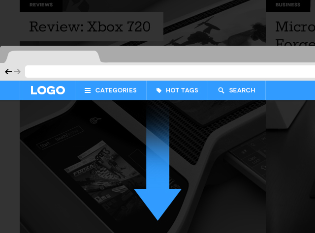
I have, and these problems while small, really bother me and countless other users too. Navigation is among the most important features in web design and focusing on it’s development will be a huge trend in 2013. To help improve the users experience and improve customer satisfaction we have recently incorporated Sticky Navigation for Desktop and Off Canvas Navigation for Mobile in JA Argo - responsive Joomla 2.5 / 3.0 template based on our all new T3 Framework , as well as in T3 Framework.
Overview of web navigation
A. Traditional navigation
In the past we would see all kinds of links listed on the top navigation bar. First we would scroll down to read the article, information, or blog post then have to scroll up to find the navigation bar located at the top of the page. Let’s be honest, that is one annoying and inconvenient thing to have to do everyday of your life.

