This is a post by Kika as part of our Customer Showcase series. If you have a beautiful project and would like to share your story and experience with the JoomlArt community, please tell us your story!
About Me
My name is Kika Bisogno. I’m a graphic and web designer and a lover of ALL THINGS NATURAL. I have been into Joomla since the days when plugins were called Mambots! and remained faithful to this CMS until now.

Narutisima - my true experience with JA Wall
My Work ‘Naturísima’
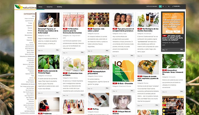
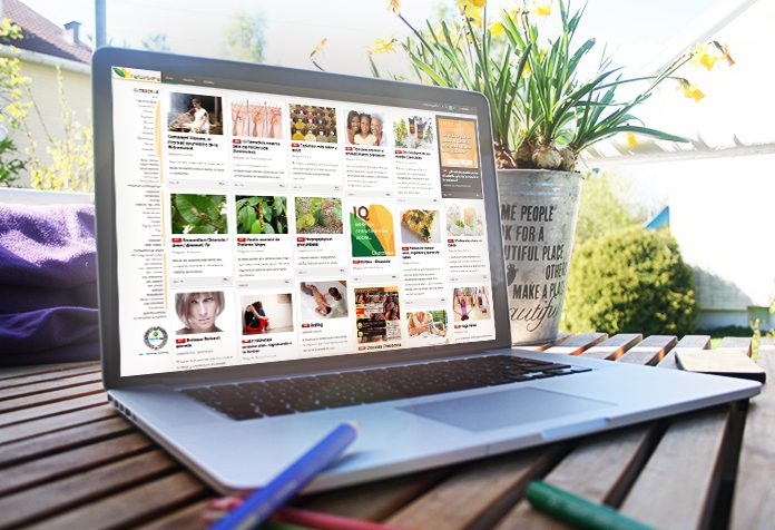
At the end of 2012, I decided to launch Naturísima - the website of my own with a twofold purpose. First, to exploit my health & wellness interest. Second, to have a web platform for experimenting with the knowledge I had acquired in setting up Joomla sites - no clients breathing on my back if I made a mistake!

Naturísima’s elegant look
My journey with JA Wall
I wanted a very straight forward, clean looking, responsive and easy to navigate website with an emphasis on the visual aspect because, you know, a picture is worth a thousand words. My choice was JA Wall, even though back then it was not part of the JoomlArt Template Club and even not built on the T3 Framework.
Lemme explain why I chose to go with a JoomlArt template first. The most important reason must be the way the templates are structured and coded. It was very easy to find one’s way around the many files that comprise a template. JA Wall was extremely sweatless to customize for the “Look & Feel” that I wanted. I could make changes and additions with ease, not only at the level of the Cascade Style Sheets, but also on other sections. I did customize a lot! I added a couple of “positions” which I required in order to accommodate some prime space for google ads; I also added an additional module Chrome to render these new positions. I created additional colored styles (based on the original module classes) in order to display information in a much more interesting way while maintaining the overall look of the site. Also, I was able to add additional responsive classes to hide certain items unfitting for mobile viewing such as the Google Ad on Homepage.
While putting together this site, I had installed and uninstalled quite a few third-party extensions. The coding on JA Wall was clean and, except for a couple of conflicts, I had never encountered any of those dreaded “fatal” errors that usually end up breaking up sites and one’s nerves.
I’m now in the process of planning my Joomla 3.x upgrade. I have the new version of JA Wall (already customized!) and I am extremely pleased with the new CORNER-STAMP position. One thing I will surely do in the next couple of months is start experimenting with THEMES. I think that the possibility to have different “seasonal” looks for the site is a great way to keep users interested!
What are your thoughts on Kika's project?! Please share with her on the comment section below!
