Hi booddha

Could you share your administrator page url and a super user access to it ?

We will have a look at your settings and answer to your question.

Take a look HERE Point-5 to see how to keep your info Private

    Hi booddha

    I published the Pricing-table-style-3 Ja acm module in your home page in spa-home position and it is showing fine as you can see , cannot see any problem on it.

    Hello,

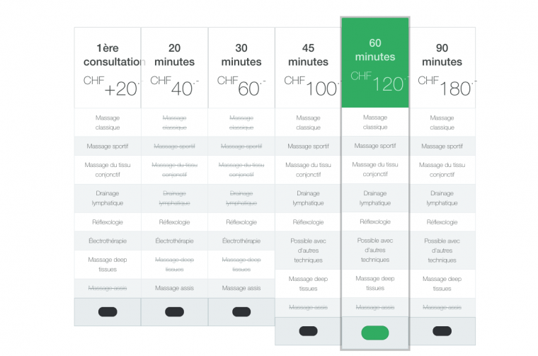
    Yes because there is only 3 colums...

    I would like to put that ont this page with more colums :
    https://www.masseurmedical.com/fr/tarifs-fr/liste-des-tarifs

    the module i edietd and i would like to publish is :
    "Liste des tarifs (2)"

    So as soon i add colums thsi changes the configuration as the pictures i put in my first message...

    Do you think is that possible ?

    NB: for now i unpublished the modules.

      booddha

      I published your module "Liste des tarifs (2)" in spa-home position and it is working fine by my side

      If you want to contain words then you should consider it is using a grid 2 space

      Ok thanks, but i don’t want it in spa-Home Position. And at the bottom, the Lines are not aligned... this is not nice.

      How do you do 2 lines Grid as you suggested?

        Hi booddha

        Unfortunately you will need to publish them in a block section configured like the spa-home block

        You can indeed try a different solution posting a 3rd party module like THIS ONE

        Or find some other module available on JED HERE

        Hope it helps

          pavit

          Hello Pavit,
          thanks for your help, so i tried to change in the template layout and put "spa-home" for one position. but unfortunately, it does not display correctly the module. BTW, i don't understand what you said "grid 2 space" what does it mean ?

            booddha i don't understand what you said "grid 2 space" what does it mean ?

            It is the responsive grid for the various screen sizes

            E.G.

            item-2 grid-xs-2 grid-sm-3 grid-md-5

            This is the code that divide a large screen size ( grid 12 ) for various views

            grid-xs-2 means extrasmall layouts ( smartphones ) set to width 2/12 and so on
            grid-md-5 means medium devices ( tablets ) layout set to 5/12

            Hope it helps

              pavit
              Sorry to say that, but no, not really. I don’t know what you talking about

                booddha I don’t know what you talking about

                You should not care about it , it is hardcoded into the template already and also into ja acm modules -

                Regards

                Write a Reply...
                You need to Login to view replies.