Thanks
I've asked the team to take a look
Cheers
Paul
Thanks
I've asked the team to take a look
Cheers
Paul
Hi,
I updated this css file: /css/custom.css on your site with this custom code:
@media only screen
and (min-device-width : 768px)
and (max-device-width : 1024px)  {
  .zentools.stacked li { background-attachment: scroll !important; }
}

@media handheld, only screen and (max-width: 668px) {
  .zentools.stacked li { background-attachment: scroll !important; }
}
It's working now, kindly check.
Regards
Hi!
I asked my client to check, I'm waiting for his answer (on WhatsApp).
Regards
saguaros
I'm sorry, but my client is unreachable from 24 hours. I can not tell if the error has been fixed or not.
Be patient a little longer.
Thank you!
Regards
Thanks please let us know but bear in mind the changes have been applied to
www.odgraphic.com/04agriq/
and not the client domain at the moment
Cheers
Paul
paulus1031
Okay! Thank you for the clarification.
At the moment I can not contact the customer again.
Please wait a little longer.
Thank you!
Cheers
Hi!
The display of the site is ok!
How can I replicate the result on the original site?
Do I just have to update the template and copy the custom.css file?
If I update the template, does the layout break up or not?
If you tell me how I have to do, I'll do everything myself instead of getting it done to you.
Thank you!
mikyilfilosofo
Hi,
First of all - please make a FULL backup of your website, then update your template, compare the custom.css files and if you find the difference, add css code from working website.
Please remember about the backup, if something goes wrong during the update you'll be able to restore your website.
Cheers
Joshua
Ok, thanks!
Cheers
Thanks for the update
Any problems please get back to us
Cheers
Paul
paulus1031
Hi!
Paul1031, thank You for opening the topic again!
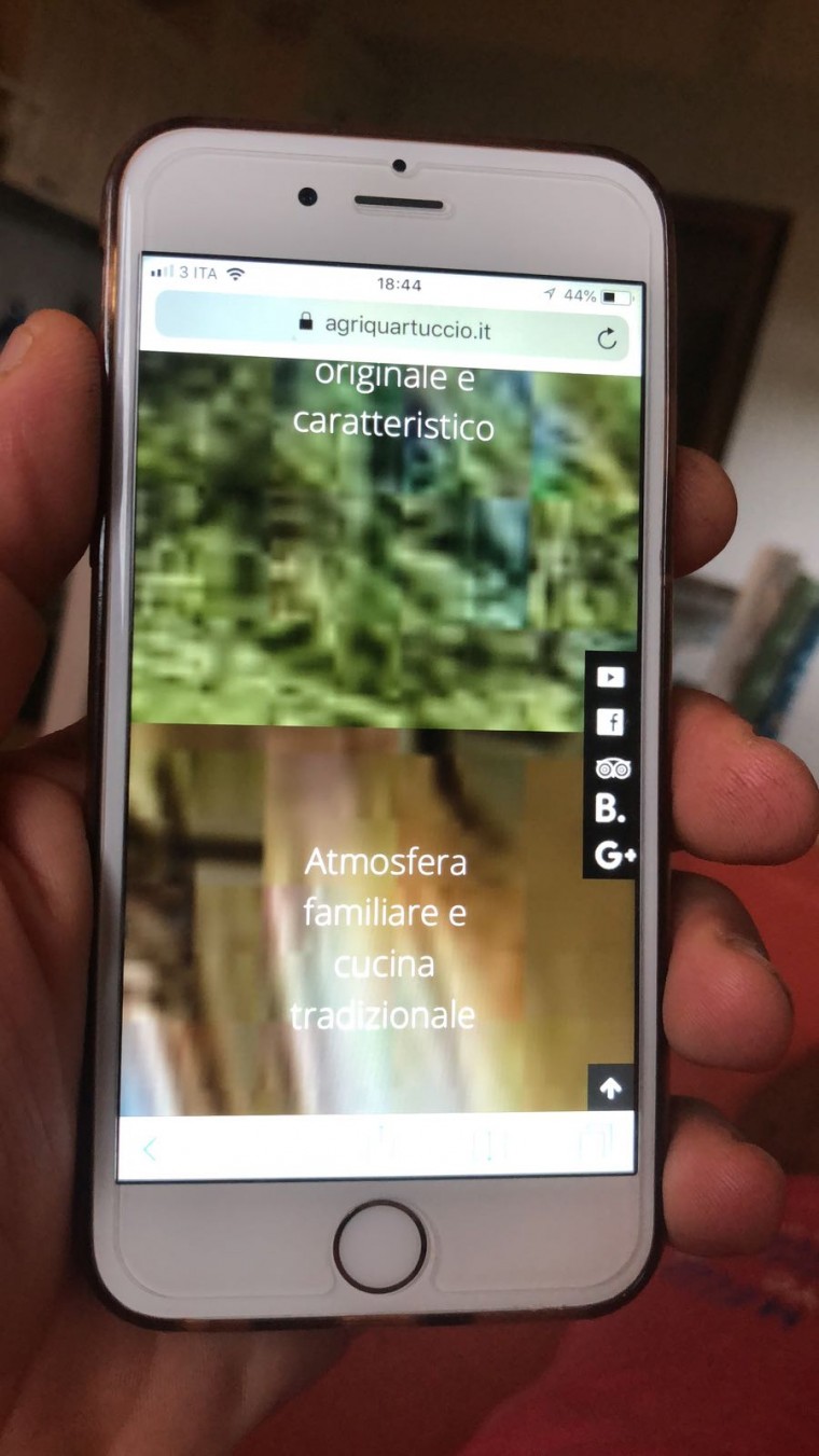
I'm sorry, but the display is OK on iPhone 6s and iPad Air, but is still wrong on iPhone X.
Thanks
Cheers
Hi
Can you attach a screenshot from the phone together with a description of the problem with iphone x?
Cheers
Paul
paulus1031
Hi!
The problem of display is the same. I did 3 things:
1) I have updated the template and the other modules of the original website.
2) I added the new CSS rules of Saguaros (saguaros#29486) to custom.css of original website.
3) I asked the client to delete the cache of the iPhone X before to check the original site.
I updated the credentials fields of this topic with the those of the original site.
Thanks!
Cheers
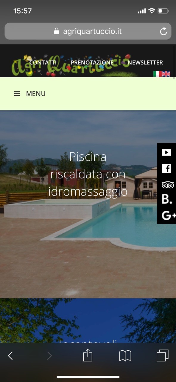
Can you include a screenshot taken by the phone?
I've asked the developers to take another look at the problem
Here is screenshot I take from iPhone X device