Last week we released the preview of the Joomla Custom Fields Filter for Joomla 3.7. Today we are announcing the updated demo and availability of Joomla Custom Field Filter download. We have also included a horizontal filter option, we would be improving its style in the coming days. Try our the Joomla field filter and let us know if you encounter any bugs, do note that this will work only in Joomla 3.7
- Joomla 3.7 custom fields filter support
- Grid layout + List Layout
- JA Megafilter module
- Horizontal view added
- Collapse fields in filter.
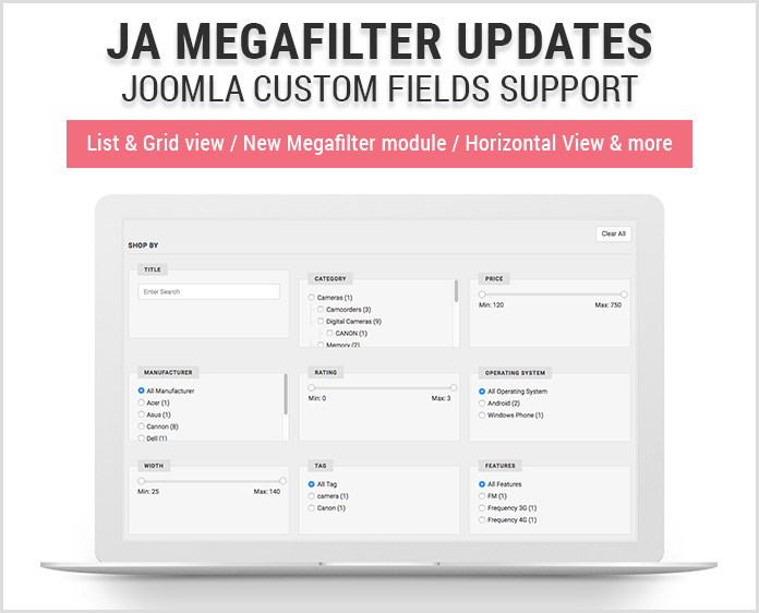
JA Megafilter updates with 5 more major new features
1. Joomla 3.7 custom fields filter support
Joomla 3.7 includes custom fields which is a nice feature. Our JA MegaFilter for Joomla now includes support for Joomla custom field filters. You can now filter Joomla 3.7 custom fields for articles based on color, calendar, checkboxes, editor, gallery, list, media, text, user, etc.
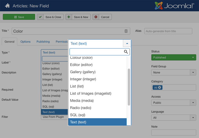
JA Megafilter supports filter for Joomla 3.7 custom fields
JA Megafilter is updated to supports the new Joomla custom fields to help build stunning Joomla articles search and filter page with basic fields: title, category, hits or custom fields: color, calendar, size, user, etc with well-structured layout and beautiful responsive design.
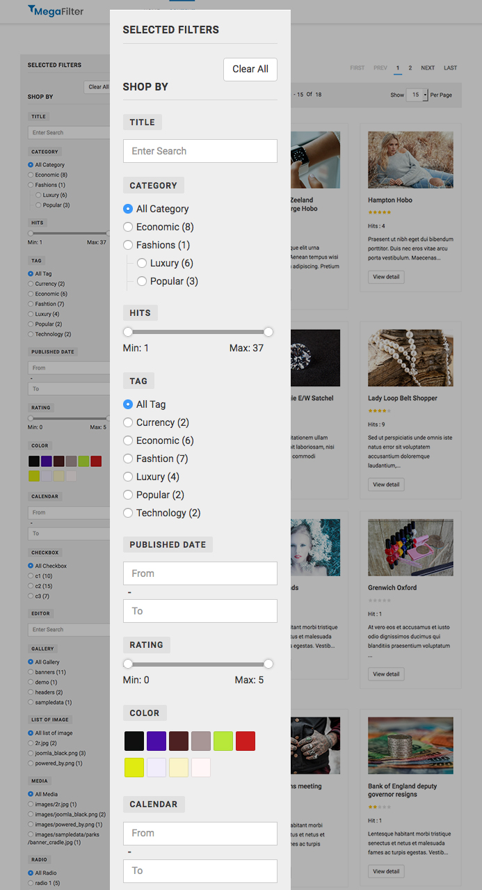
Joomla custom field search and filter page built with JA Megafilter
2. JA Megafilter module
Before, in JA Megafilter page, the search and filter bar was always fixed on the left sidebar, that is not flexible as some users requested to put it in a different position. The module will help resolve the issue. You can create megafilter module for specific JA Megafilter page and display the module in position you want.
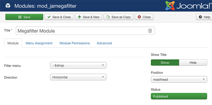
JA Megafilter filter module configuration
The module has 2 views: vertical & horizontal.
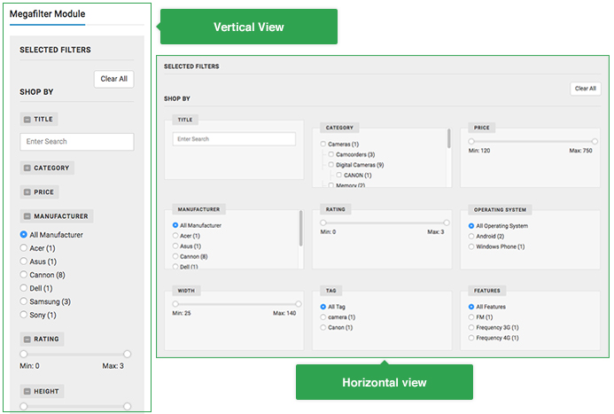
Vertical and horizontal view
3. Search & Filter Horizontal view
Before, the Search and filter was displayed in the vertical view alone, and we got many requests to provide support the for horizontal layout. In the JA Megafilter menu item setting, you can set vertical or horizontal for the search and filter bar.
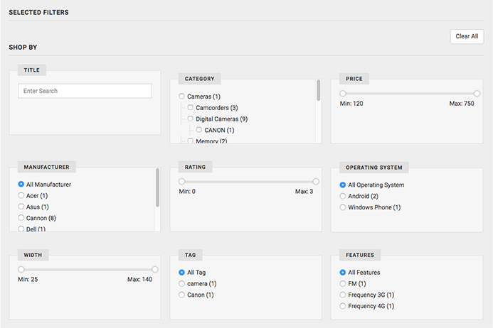
Horizontal view for search and filter
4. Grid and List view
In the items list page, it now supports 2 views: grid and list. Both views are clean and well structured to display items in smart ways.
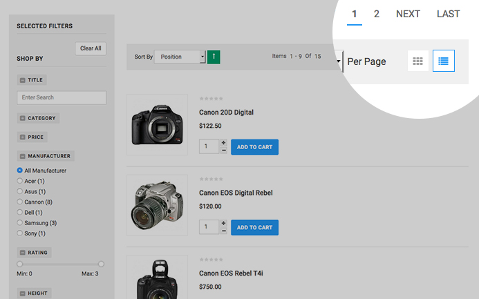
Horizontal view for search and filter
5. Filter fields collapse
If the search and filter bar has many options and it will become long, user has to scroll a lot to view all filters, the filter collapse feature will fix the issue, user can collapse the filters to save space.
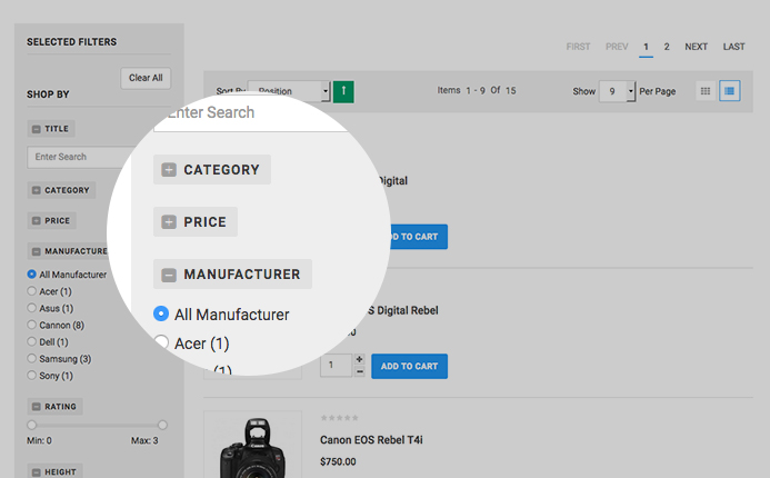
Filter fields collapse

