So you own an online Magento store and wonder if you should go mobile and join the Mobile Commerce (m-Commerce). The question here is: is your store ready yet?
Using our Magento responsive theme - JM Megamall as the illustration, we will analyze the theme and walk you through some of the points that you should take into consideration when prepare for m-Commerce.
Why Mobile Commerce?
You may hear this term somewhere before, and believe me, this market is expending. Customers nowadays are using mobile devices for shopping intensively. You can consider the year 2013 as such a remarkable year for Mobile-Commerce (m-Commerce). According to comScore, the spending on m-Commerce achieved 10.6 billion in sales on the first half of the year, which increased 24% versus the last year. This report also estimated that m-Commerce could surpass $25 billion for this whole year. In total, m-Commerce is now more than 10% out of the whole e-Commerce sales without any sign of declining. Not on m-Commerce yet? It’s urgent to smartly get your online store mobilized right away.

What make responsive Magento theme JM MegaMall optimized for m-Commerce
1. Responsive layout
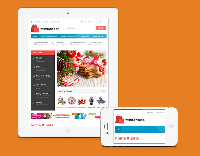
JM Megamall with Responsive layout for mobile and tablet
Responsive layout is a must! Responsive layout will help your site presentable on mobile devices and tablets. As you can see from our Magento responsive theme JM Megamall, the theme is 100% responsive, all the content are well presented even on collapsed mobile screens. Not only that, the Magento extension JM Basetheme which is packed with themes, supports specific mobile settings so that you have total control over the responsive settings.
2. A neat Homepage with product spotlights
When it comes to narrow screen resolution, you have to well manage the content so that you store will not look messy, especially the Homepage.
The Homepage layout on phone is single column and for a tablet it is double or triple column. It is not a good idea to present too much information on Homepage, consider the Homepage as the road map, you only need to show off essential things like featured product, important sale information and so on. Stay focus and not to confuse your shoppers.
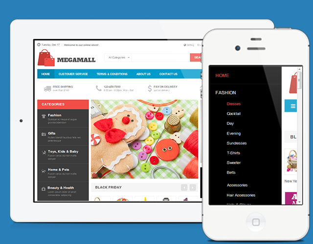
Homepages for mobile devices in JM Mega Mall
3. Boost up the site Navigation
If for desktop you can totally have a big impressive drop down menu with all the product categories on it, but for mobile and tablet, you will need to tweak it a little bit. You want to make sure that every shopper when they come to your store on phone, they can freely navigate the store and find their products. For that reason, the Off-canvas menu comes to rescue the day.
With just a touch, the menu will slide out and in, and still present well your product categories in such a neat way. It saves your space while keeping your content reachable.
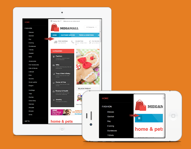
Off-canvas menu in JM Mega Mall
Besides, you can use the site-wide navigation. Unlike Off-canvas menu, the side-wide navigation is tweak version of the dropdown menu. Touch on the menu icon, and the whole dropdown menu will show up, as you see from our illustration below from JM Wall theme.
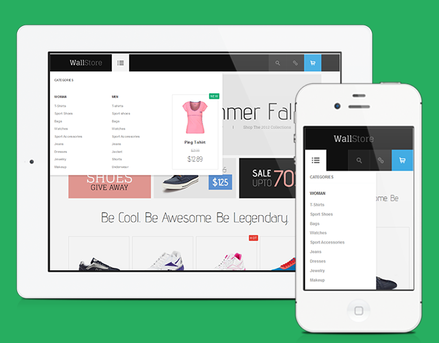
Site-wide navigation in JM Wall
Tip a search box on navigation bar can be very handy. Quickly search for products can save time for shoppers.
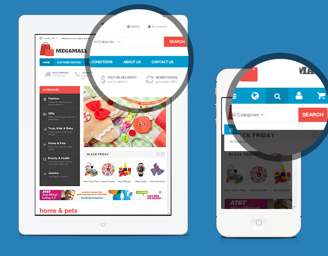
Search box in JM Mega Mall
4. Optimize the Product Page
Now we come to one of the most important pages: the Product page. This is where shopper get details about your products, and you know what happens when the information is not well presented: you will lose sales. Applied for our Magento theme JM Megamall,we support: accordions and tabs on product pages so the content can be divided in to categories and switching between them is much easier.
Categorizing your product details into accordions or tabs is effective in term of stacking it up for a neat presentation of content.
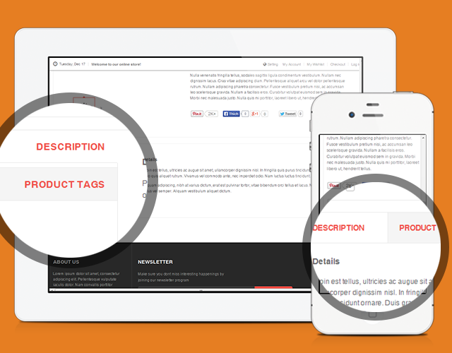
Tabs for Product page in JM Mega Mall
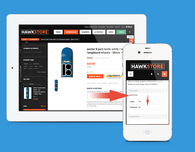
Accordions for Product page in responsive Magento theme JM Hawkstore
5. Simplify the Checkout process
In m-Commerce, a complicated checkout process can discourage shoppers when they are too close to the payment already. In our theme JM Megamall, we support anonymous check-out where shoppers just check out without signing up or logging in. Even when registration is required, we suggest that only showing the necessary information so shoppers can quickly fill in from their phone and make payment.
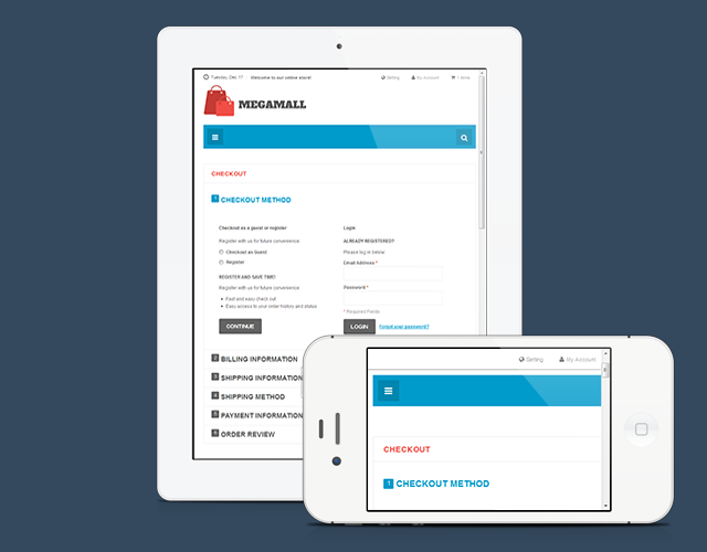
Checkout page in JM Mega Mall
6. Reinforce your site security
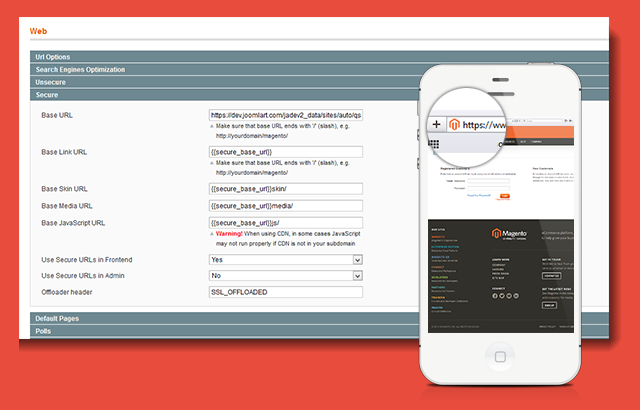
Enable your store to HTTPS
This part is crucial for any online store, nothing could fail customers faster more than an insecure site. When Magento 1.8 was released, the Security part has been highlighted as one of the most important improvements in Magento. Especially this version of Magento has reinforced the security system against attackers and also you can enable your store into HTTPS right in the back-end for better security.
To sum up
From the sample of responsive Magento theme JM Megamall, I hope that you can have a general picture of whet need to be done to get your online store ready for m-Commerce: responsive layout, content-oriented, smooth navigation, optimizing product pages as well as check-out process and not to forget the site security.

