Have you ever been on a website and just can’t figure out how to navigate to a certain page? Or perhaps suddenly been frustrated by trying to find the navigation bar after reading through countless comments or posts down the page. Not only is this annoying but often happens even more when using a mobile device or tablet, and is more complicated to remedy.
I have, and these problems while small, really bother me and countless other users too. Navigation is among the most important features in web design and focusing on it’s development will be a huge trend in 2013. To help improve the users experience and improve customer satisfaction we have recently incorporated Sticky Navigation for Desktop and Off Canvas Navigation for Mobile in JA Argo - responsive Joomla 2.5 / 3.0 template based on our all new T3 Framework , as well as in T3 Framework.
Overview of web navigation
A. Traditional navigation
In the past we would see all kinds of links listed on the top navigation bar. First we would scroll down to read the article, information, or blog post then have to scroll up to find the navigation bar located at the top of the page. Let’s be honest, that is one annoying and inconvenient thing to have to do everyday of your life.
B. Sticky Menu Navigation on Desktop
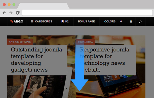
No more having to scroll up forever in order to navigate back to the homepage, as the navigation controls are now fixed (sticky) and easily accessible from anywhere on the page. The controls are now visible and easy to access even when going from one headline to another.
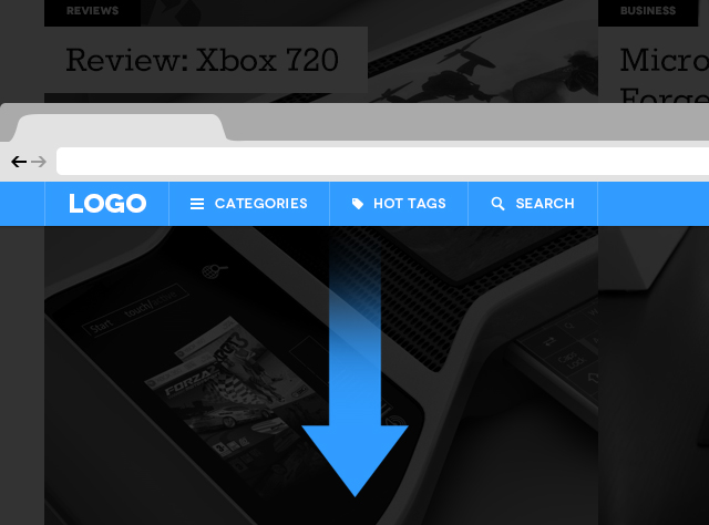
Sticky navigation stays even when you are scrolling down the page
Advantages?
- Can be applied to any kind of menu on your website: top or bottom. This bring great flexibility and versatile to your page.
- 22% quicker to navigate means quick loading website and less unhappy visitors.
C. Off-Canvas Navigation on Mobile Devices and Tablets
Half of the time we find ourselves surfing the net on our mobile or tablet at home or on the way to work, or in bed before sleeping or just about anywhere else due to the portability and convenience of mobile devices. With the ever increasing use of mobile devices businesses should be sure their content looks as good on every type of device, no matter what size the screen.
The major problem on mobile devices is screen space, the elements seem to stack up together on a small screen. That’s where the Off-Canvas navigation comes to the rescue by taking advantage of “off the screen” space in order to keep the content or navigation hidden until a larger screen allows it to be visible or the user takes action to expose it.
Technical elements that are used in Off-Canvas navigation:
- Code based: In use to develop a solid foundation of semantic HTML and widely supported CSS
- Off-canvas layout : is rather a design pattern and often misunderstood as a plugin or framework. It can have 2 or up to 3 panels that would be displayed differently based on the device’s width. The main panel will stay in center, and depend on the hidden panel’s position (which we can call here the Off-Canvas navigation) we’ll have the anchor element laid on the planned position for that hidden panel (either right or left, or on both sides)

Your Off-Canvas layout is rather a design pattern
D. THE PIONEER
If you are a Facebook geek like I am and use the Facebook app on a daily basis then you probably recognize its Sticky Navigation on your desktop and its Off-Canvas menu on your mobile. These features enhance and upgrade the Facebook experience by having a well organized and easy to use navigation system. Facebook is a pioneer in site navigation and is earning respect through its revolution of navigation systems.

Facebook's sticky navigation on desktop

Facebook Off-Canvas navigation on tablet
E. OFF-CANVAS AND STICKY NAVIGATION ARE WIDELY ADAPTED
- Mashable - A News website
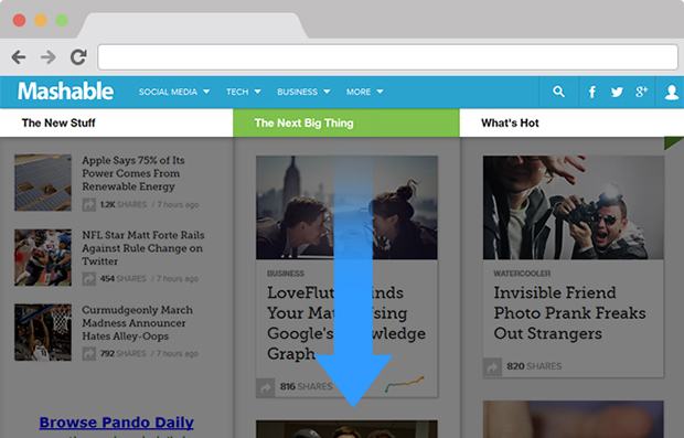
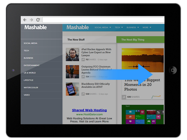
Sticky top menu on Desktop and Off-Canvas left navigation on Tablet/Mobile

Mashable sticky top menu navigation on desktop

Mashable Off-Canvas navigation on mobile
- The Next Web - A News website
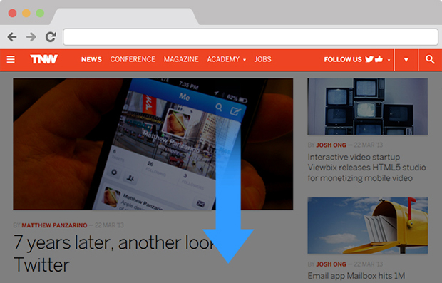
Similar to Mashable, The Next Web integrated the top menu sticky navigation.

The Next Web sticky top menu navigation
- ReadWrite - A News website
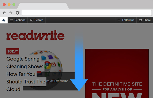
Readwrite also loves the sticky top menu navigation.

ReadWrite Sticky top menu navigation on desktop
- Disney - An entertainment website
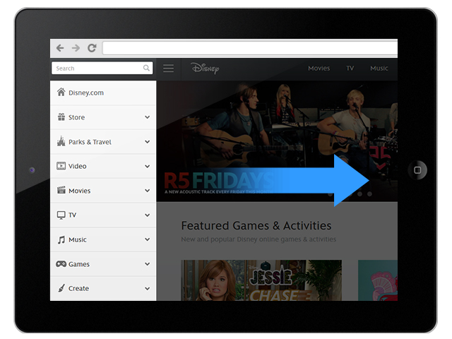
Disney uses the Off-Canvas menu technique on its mobile/tablet version of the website. Whenever the left off-canvas menu appears, the main panel is shifted over to the right and blurs away, driving the visitors focus to the Off-Canvas menu.

Disney Off-Canvas navigation on tablet
- Nixon - Online Fashion Store Website
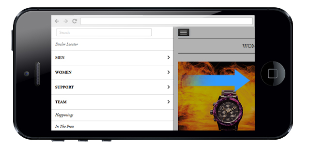
Like Disney, Nixon only applies the left off-canvas menu technique on their mobile/tablet version. It is used to display their products’ list in the online shop, to support its customers who will appreciate a seamless transition from one category to another while shopping.

Nixon Off-Canvas navigation on mobile
III. Sticky Menu and Off-Canvas Navigation: How do they work on JA Argo & T3 Framework?
A. Sticky Menu & Off-Canvas Navigation on your JA Argo & T3 Framework
Coming from a users perspective on web page navigation, we agreed to include this major feature into T3 Framework version 1.2.0 and also in our March 2013 Joomla template JA Argo.
- On Desktop
JA Argo has its “trendy” sticky top megamenu

JA Argo with its sticky top megamenu on desktop
- On mobile/tablet version
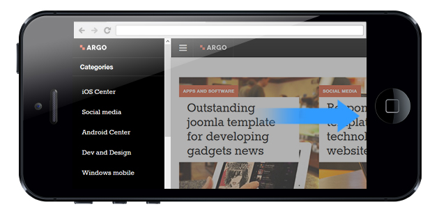
You can easily navigate through Argo’s left off-canvas navigation where you will find the categories’ list to navigate to.

JA Argo with its in-trend Off-Canvas navigation on mobile
B. How to enable Off-Canvas in T3 template Framework for Joomla 2.5 / 3.0
From your template’s back-end, open the Navigation tab then enable the option Off-canvas Navigation to active the Off-Canvas feature.
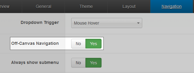
Enable Off-Canvas in T3 Framework
C. How to active your Sticky Top Menu Navigation
- Add class navbar-fixed-top (which will apply the fixed effect for desktop) and navbar-collapse-fixed-top (which will apply the fixed collapse menu effect for mobile) to #t3-mainnav div in the header.php file located in templates\ja_argo\tpls\blocks folder.
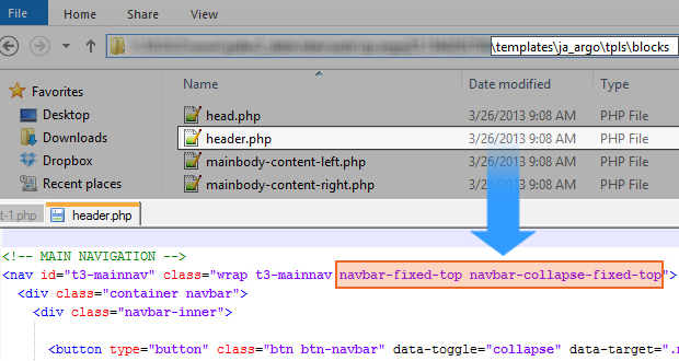
Active your Sticky Top Menu Navigation
After enabling these features, you can style for your menu under the navigation.less file located in \templates\template_name\less folder.
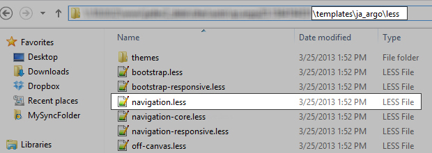
Style your menu under navigation.less file
You can also update the navigation’s margin-left & margin-right for the mainnav div according to your preference in the same file. In our case, we set both to 0.
Here is an example on our parameter that we set for JA Argo
- .t3-mainnav {
- #gradient > .vertical(@navbarBackgroundHighlight, @navbarBackground);
- border-top: 0;
- border-bottom: 0;
- height: @navbarHeight;
- .navbar {
- color: @navbarText;
- font-size: @T3smallFontSize;
- margin-bottom: 0;
- margin-top: 0;
- }
- .navbar-inner {
- min-height: @navbarHeight;
- padding: 0;
- background: transparent;
- border: 0;
- position: relative;
- .border-radius(0);
- .box-shadow(none);
- .reset-filter();
- }
- ...
- }
D. Guidelines on how to customize those for your old T3 Framework (also known as T3v3) templates
In order to make it applicable to the old templates which are developed on the latest T3 Framework foundation such as JA Brisk, JA Mero and JA Onepage, you have to:
- Upgrade your T3 Framework to the version 1.2.1. Please always consider to back-up your site first before proceeding the upgrade. More on the upgrade instructions can be found at T3 Documentation section.
- Follow Step B & C to enable your desired feature.
Note:
In Step C, in order to active your Sticky Top Menu navigation in the old templates, please search for #ja-mainnav in JA Mero & JA Mitius, and #t3-mainnav in JA Brisk, JA Onepage & JA Argo under mainnav.php for JA Mero & JA Mitius and header.php for JA Brisk, JA Onepage & JA Argo.
Also remember to replace #t3-mainnav to #ja-mainnav in the code above. Happy Customizing!


