There was a very interesting blog post "10 web design trends that we can expect to see in 2013”. Out of those ten, four of the predicted trends caught my attention and they seem to be trending pretty well as the year 2013 is progressing.
- The Responsive Web Design popularity
- Skeuomorphism glory is fading away
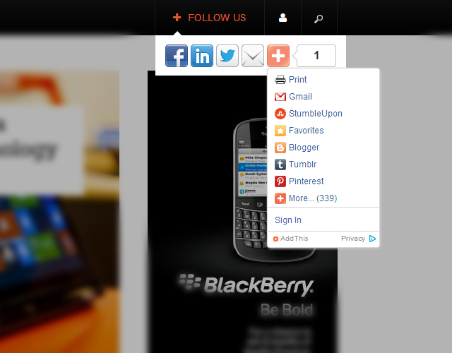
- More Social Sharing please
- Content is still the King
Argo Inspiration - design changes of major blog / magazine sites
Recently most of the well-known, heavy traffic news / magazine websites such as The Next Web (TNW), Mashable and ReadWrite are changing their website design and feel, leaning toward the flat design trend with sticky navigation sidebar or header and value typography along with its content, which is understandable for News website to concentrate on texts rather than graphics.

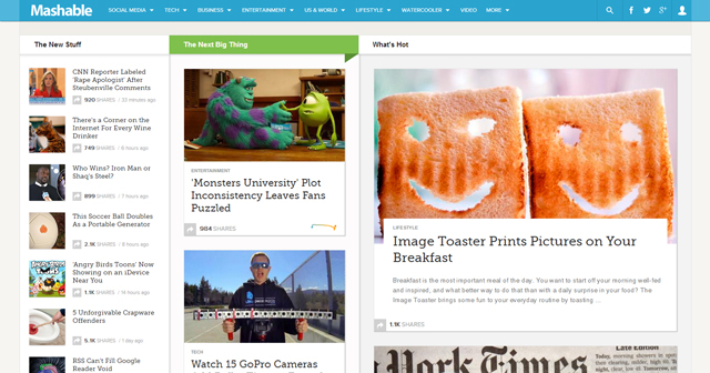
I felt so inspired and encouraged to come up with the design concept for JA Argo. We spent hours to elaborate on how our JA Argo is going to look like and work like. From that foundation, we BUILT our JA Argo template. Yeah, its release got delayed but it was worth giving a shot.
7 THINGS YOU SHOULD KNOW ABOUT JA ARGO
1. A Website for your News & Magazine
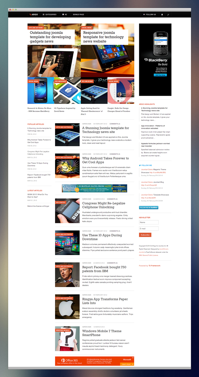
JA Argo allows you to build your own TNW or Mashable version website but better. At least, you won’t need any customization. Almost effortless! The only thing that matter is your content. Trust me buddy, let them shine!
2. Flat design
No more fancy design, JA Argo is left with clean and performance-focused (faster, and more efficient).

3. Responsive
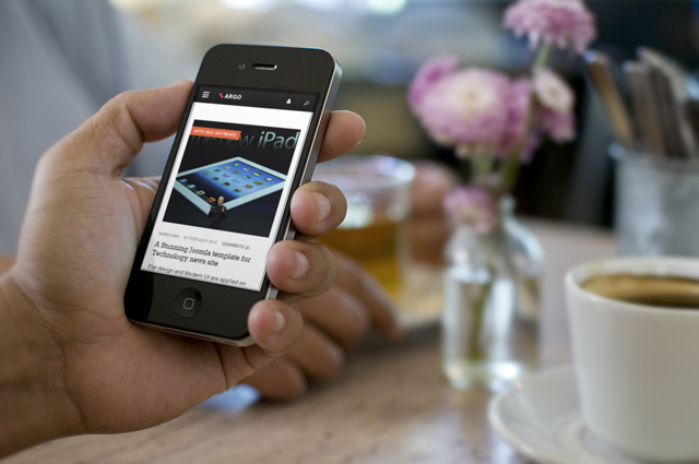
Adopting flat design brings great scalability when it comes to designing for multiple devices. You can make it once and are assured that it would look great on all screen sizes, that on the other hand, guarantee your user experience to stay the same through any of web related browser and devices.
4. Tablet and Mobile Reading experience
I have to confess that it is almost impossible for me to forget my mobile at home nowadays. Facebook, Tweet and Youtube have taken its toll on me, for that I blame the social media. The success of Responsive Web Design is to encourage us to surf through news, blog and magazine website on our mobile, tablet on the go. Looking at the navigation bar on TNW and ReadWrite, we can definitely tell its target are tablet and mobile users. We picked up from there and design JA Argo accordingly to enhance the user experience on tablet and mobile in reading news/blog/magazine.
5. Fixed navigation bar so-called sticky navigation sidebar and header
Often while browsing in a news/magazine website, we are lost in news after news, headlines after headlines and articles after articles. The fixed navigation header and sidebars will make sure you stay on track and always find yourself a way back to home.
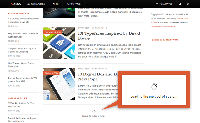
6. Infinite scrolling
JA Argo inherits this awesome feature from JA Wall. The readers can carry on reading the news, headlines, articles by scrolling down without navigate to other pages. Needless to say, content is your best friend!
7. Social sharing
We have pretty much allow to share on all the social channels that you are looking for. As the 2013 trend is moving toward more on the social sharing, we treasure them too.
