Hero Slideshow Not

- Edited
Hi app1cker,
1/ To customize the countdown style, you can go to the /templates/ja_findus/acm/countdown/css/style.css file.
Also, all the ACM type, you can custom the CSS code from the /css/style.css
About the language, you should add the to \language\en-GB\en-GB.mod_ja_acm.ini file. If this file includes these labels, you can replace/edit them.
2/ From now on, you can copy the ACM types in the \templates\ja_findus\acm and \templates\ja_findus\js folder, Because, I have updated some the CSS code:
And copy the assets.json and global.json file from the \templates\ja_findus\etc folder.
Hope this helps!
- Edited
@"Dominic" I see the improvement, Thnx!
The thumbnails are however showing and covers majority of the slideshow @ Responsive view UNLIKE the dots well published on your demo. I think this should be the last fix before I copy it to production other than the video player canvas height proportionately taller than in your demo, ....slideshow texts etc.
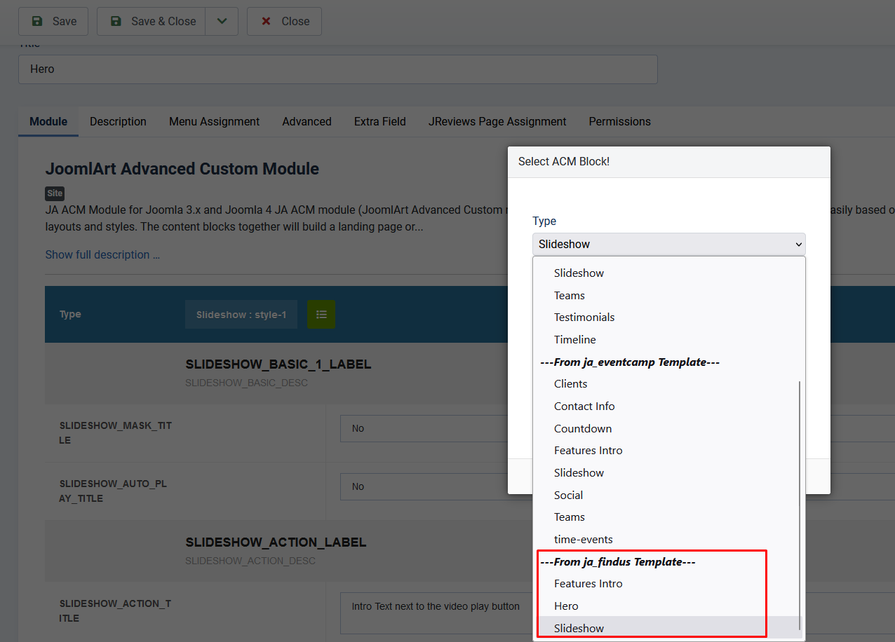
So I should copy ONLY these ACM folders/type ?:
1/ Add the following folder to the \templates\ja_findus\acm:
2/ Add the following folder to the \templates\ja_findus\js:
3/ Override the assets.json and global.json files to the \templates\ja_findus\etc
Hi app1cker,
To hide on the mobile, you can add the following CSS code to the **templates\ja_findus\acm\slideshow\css\style.css** file:
@media (min-width: 992px) and (max-width: 1199px) {
.hidden-md {
    display: none !important;
}
}

@media (min-width: 768px) and (max-width: 991px) {
.hidden-sm {
    display: none !important;
}
}

@media (max-width: 767px) {
.hidden-xs {
    display: none !important;
}
}
2/ Yes, copy ONLY these \templates\ja_findus\acm.
Hi app1cker,
You can copy the video folder from the ja-tour/acm folder to the ja-findus/acm folder and add the following CSS code to the ja-findus/acm/video/css/style.scc file:
.acm-video.style-1 .video-description {
  padding: 200px 150px; }
  @media (max-width: 1419.98px) {
    .acm-video.style-1 .video-description {
      padding: 90px; } }
  @media (max-width: 767.98px) {
    .acm-video.style-1 .video-description {
      padding: 60px 30px; } }
  @media (max-width: 767.98px) {
    .acm-video.style-1 .video-description .text-white {
      font-size: 26px; } }
  .acm-video.style-1 .video-description .btn-actions {
    margin-top: 90px; }
    @media (max-width: 1419.98px) {
      .acm-video.style-1 .video-description .btn-actions {
        margin-top: 30px; } }

.acm-video.style-1 .video-item {
  position: relative; }
  .acm-video.style-1 .video-item .ft-bg {
    background-size: cover;
    background-position: center center;
    position: absolute;
    top: 0;
    left: 0;
    height: 100%;
    min-height: 400px;
    width: 100%; }
    @media (max-width: 1199.98px) {
      .acm-video.style-1 .video-item .ft-bg {
        position: static; } }
    @media (max-width: 767.98px) {
      .acm-video.style-1 .video-item .ft-bg {
        min-height: 250px; } }
  .acm-video.style-1 .video-item .play-icon {
    position: absolute;
    top: 50%;
    left: 0;
    margin-top: -60px;
    margin-left: -60px; }
    @media (max-width: 1199.98px) {
      .acm-video.style-1 .video-item .play-icon {
        left: 50%; } }
    @media (max-width: 767.98px) {
      .acm-video.style-1 .video-item .play-icon {
        margin-top: -40px;
margin-left: -40px; } }- Edited
Hi app1cker,
You can add the following CSS code to the ja-findus/acm/video/css/style.css file:
.no-gutters > .col, .no-gutters > [class*="col-"] {
    padding-right: 0;
    padding-left: 0;
}

.acm-video.style-1 .video-description {
  background: #30408d;
}

.play-icon a {
  background: #fff;
  -webkit-box-align: center;
  -ms-flex-align: center;
  align-items: center;
  border-radius: 50%;
  color: #F6376A !important;
  display: -webkit-box;
  display: -ms-flexbox;
  display: flex;
  font-size: 25px;
  -webkit-box-pack: center;
  -ms-flex-pack: center;
  justify-content: center;
  position: relative;
  text-indent: 3px;
  height: 120px;
  width: 120px; }
  .play-icon a:before, .play-icon a:after {
    border: 1px solid #fff;
    content: "";
    position: absolute;
    z-index: 0;
    left: 50%;
    top: 50%;
    -webkit-transform: translateX(-50%) translateY(-50%);
    -ms-transform: translateX(-50%) translateY(-50%);
    transform: translateX(-50%) translateY(-50%);
    display: block;
    width: 120px;
    height: 120px;
    background: transparent;
    border-radius: 50%;
    -webkit-animation: pulse-border 2200ms ease-out infinite;
    animation: pulse-border 2200ms ease-out infinite; }
  .play-icon a:after {
    -webkit-animation-delay: 600ms;
    animation-delay: 600ms; }
    @media screen and (-ms-high-contrast: active), (-ms-high-contrast: none) {
      .play-icon a:after {
        display: none; } }
  .play-icon a:hover {
    background: #F4F4F5;
    text-decoration: none; }
  @media (max-width: 767.98px) {
    .play-icon a {
      height: 80px;
      width: 80px; }
      .play-icon a:before, .play-icon a:after {
        height: 80px;
        width: 80px; } }

@-webkit-keyframes pulse-border {
  0% {
    -webkit-transform: translateX(-50%) translateY(-50%) translateZ(0) scale(1);
    transform: translateX(-50%) translateY(-50%) translateZ(0) scale(1);
    opacity: 1; }
  100% {
    -webkit-transform: translateX(-50%) translateY(-50%) translateZ(0) scale(1.3);
    transform: translateX(-50%) translateY(-50%) translateZ(0) scale(1.3);
    opacity: 0; } }

@keyframes pulse-border {
  0% {
    -webkit-transform: translateX(-50%) translateY(-50%) translateZ(0) scale(1);
    transform: translateX(-50%) translateY(-50%) translateZ(0) scale(1);
    opacity: 1; }
  100% {
    -webkit-transform: translateX(-50%) translateY(-50%) translateZ(0) scale(1.3);
    transform: translateX(-50%) translateY(-50%) translateZ(0) scale(1.3);
    opacity: 0; } }
2/ Yes, all you need to copy is child folders in the ACM module folder, js folder, and assets.json and global.json files.
- Edited
- Edited
- Edited
- Edited
- Edited